


Anyway, a little shorter this month whilst we’re busy working away on some big things, but here it is!
Mod Browsing Open Beta
A big thank you from us to everyone who has engaged with the open beta and sent their feedback. Overall, it’s been incredibly positive, which we’re pleased to see.
Here is an overview of the feedback responses that we have received via the feedback pop-ups on each of the pages which were changed.
Game listing pages scored 4.4/5 (113 responses)
Mod listing pages scored 4.3/5 (756 responses)
Game home pages scored 4.0/5 (1,219 responses)
Off the back of the feedback we’ve received from you all, we’ve been hard at work updating features, fixing bugs and optimising performance. Here’s a quick rundown of what we have been up to:
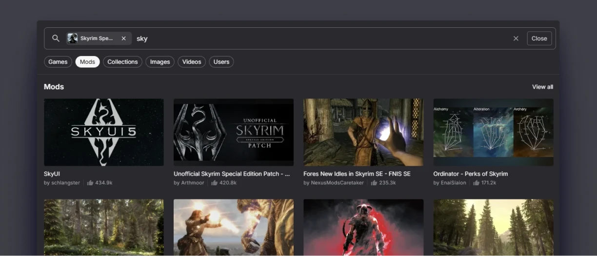
The Reworked Quick search is being rolled out across the different types of content on the site. You can see this for Mods, Collections, Games, Images and Videos. User search and a combination of the above that searches for all content is coming soon!
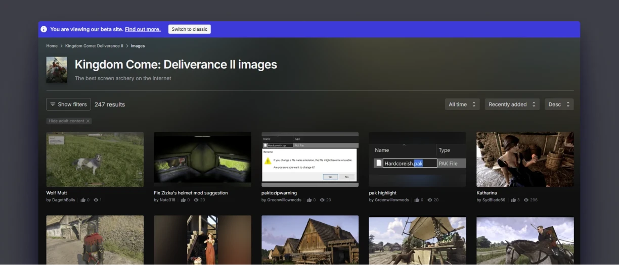
The image and Video Listing pages have been updated to match the new mod listing pages.
- The "Tags" filter on mod listing pages (e.g. www.nexusmods.com/stardewvally/mods) now includes all applicable tags (previously limited to 100).
- Fixed a bug that caused page titles to vanish when viewing open beta pages.
- "View all" links on game home pages now correctly link to all content and respect your site preferences (i.e. default sort order and results per page).
- Opening search results in a new browser tab now works as expected and keeps the current tab (and search UI) open.
- Fixed an issue when filtering mods by categories, which now works and no longer incorrectly returns zero results.
- Mod tiles now correctly show the number of downloads.
- Added 'Downloaded' and 'Update Available' labels to mod tiles in the 'Trending Mods' section and the search UI.
- Removed supporter (NSFW) images from the Media section on game home pages.
- The Media section on game home pages now respects your blocked content settings (i.e. blocked authors).
- Fixed a bug causing error pages to return when running a search on mobile with the open beta enabled.
We have even more improvements on the way, which we hope will be ready very soon. Keep an eye on the forum post for more details when they become available.
Changes
A new ‘Mod Author Benefits’ page is now live, explaining how authors benefit from uploading to Nexus. We’re already pointing to this new page in our beta on the upload a mod modal and below the filter search.
Tech Talk
- Production cluster: Set up a second production cluster for global load balancing and failover. This reduces risk when making changes, allowing us to roll out and test updates without impacting users.
- Security fixes: Addressed several exploits and security vulnerabilities reported through our open bug bounty program.
Eww, Bugs
- User profiles: Viewing profiles with invalid usernames now correctly returns an error.
- Add Collection button: Now functions properly, regardless of how many times you press it.
- Classic game home pages: No longer display the site header and footer within the 'More Mods' section.
- Account settings errors: Feedback errors that went missing have now been restored.
- Archived mod files: Files visible in the archived section of mod pages are now correctly showing the details after these briefly disappeared.
- Donation Points display: Mods blocked from earning Donation Points now correctly show that status on their page in the Permissions expander.
As always, keep your feedback coming; we’ll bring more updates next month!
51 comments
Comments locked
A moderator has closed this comment topic for the time beingWe're rolling out the "Mod Browsing Overhaul" changes to the website gradually over the next few weeks. For more info on that, check this announcement.
If you'd like to share your thoughts on he recent website changes, join the discussion the forum thread here.
Another thing is the new UI for the trending mods. Why are popular collections shown at the start and why do they take up so much space? Isnt there a seperate tab for collections already?
We're actively monitoring P90/95/99 load times on all the new pages and they're performing well across the board, we had strict goals not to slow the pages down. This might be something with your specific setup, or perhaps some other issue that's hard to diagnose.
Collections are an important feature on Nexus Mods and make modding easier for many of our users. They did not previously have a separate tab and adding them to 'More Mods' would be confusing.
We made the decision to remove the colours years ago and stopped adding them to new games as a result. It's extra overhead for us to manage and really unexpected behaviour for most people new to the site.
another anoyyance that this feature has is that after closing the seach pop up it takes you back to the top of the current page, anoyying.
diziet