About this mod
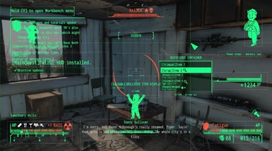
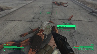
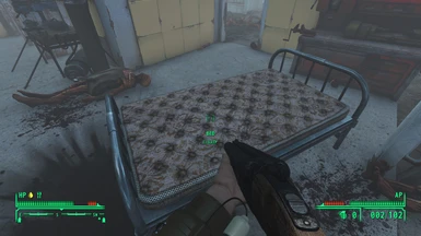
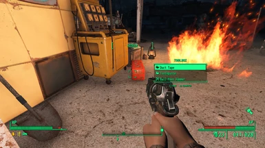
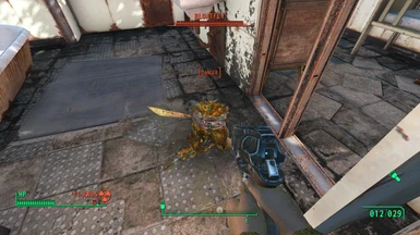
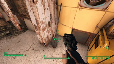
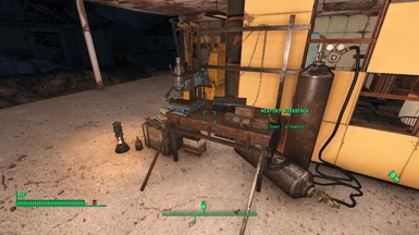
Sort of middle ground between Vanilla Fo4 and FNV UI.
- Requirements
- Permissions and credits
- Changelogs
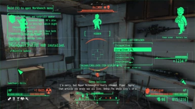
Notable differences from m8r98a4f2's original preset
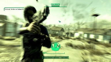
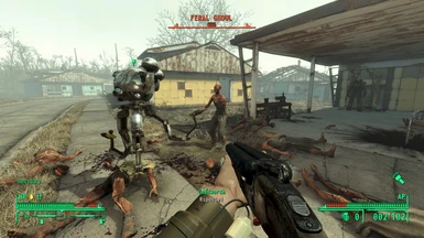
- Most bars have the same length as Vanilla (hp, ap, enemy hp, etc.)
- Uses a vanilla compass and a crosshair.
- Alpha values for empty containers and Button hints resemble vanilla more closely.
- Moved up the EXP bar so it doesn't overlap with the workbench UI.
- Unified message/tutorial/quest vault boy positions. The prompt message is aligned with them.
- Item rollover menu moved closer to the center of the screen.
- Rad, Fatigue Icon size changes and alignment
- AP bar and ammo counter are not permanently visible. You can tick the checkbox back in the MCM menu but expect some clipping in the dialogue menu (photo below). Or you can manually make some space between them. I think it looks weird tho.

Alternative Plus version
This version utilizes Fallout New Vegas - A FallUI HUD layout's UI Framework elements for FNV-styled compass and crosshair.
Moving the compass under the HP bar granted some space in the bottom middle, and since the crosshair only spread horizontally item rollover menu could moved to right below the crosshair. Perk Vault Boy pop-up goes to the newly secured space between them.
+ Just one thing: FallUI HUD's Quickloot menu has a tiny black dot.

This dot is much more noticeable when using Fo3 borders/brackets than vanilla ones.
Fonts
Modofonto is nice but suffers some cut-off issues (e.g. Perk descriptions, three-digit numbers in VATS).
I recommend Compact Fonts. It's slim and modern while retaining the iconic style.
