Monthly Roundup - June 2024

  • Comment
Another month has flown by and with it comes our next monthly roundup for you all. This month it’s a little shorter as we’re still partway through our 3-week work cycle, but we wanted to update you on what we’ve accomplished in June.


The Nexus Mods App Alpha Test
A big one this month is the launch of the Nexus Mods app alpha test. We cannot stress enough how early stages the app is, and it currently only supports Stardew Valley. While we do have plans to support more games over time, this will be a long process, so bear with us. However, it is still incredibly exciting to be able to invite people to test and give feedback on their experience with it in its current form. A lot more details and information about this alpha test can be found here in our news post.


New Payment System
If you’re a premium member, you’ll have seen that our new payment system, Paddle, is now live. This means that from now on, all new premium subscriptions will go through Paddle. As we previously announced, the price of all premium members subscriptions will be increasing.

The online landscape has evolved over the last few years, and we’re now at the stage where we need to collect taxes globally. The downside is this has meant a price increase for our premium membership. But on the plus side, we can now serve more users from more countries. This change to Paddle also opens the door for us to explore other payment options in the future.
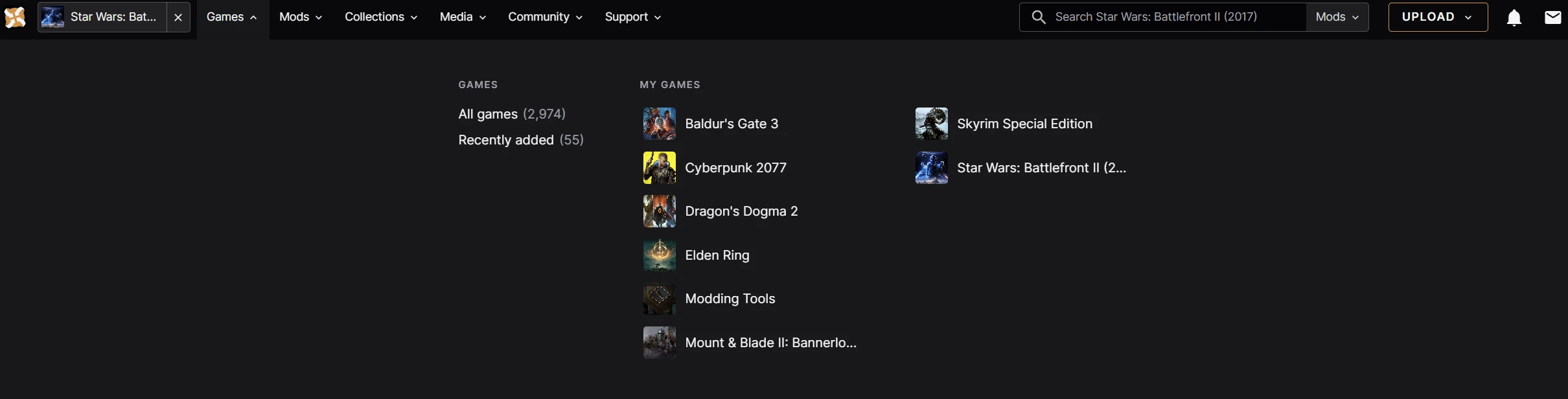

Navigation Changes
We’ve made several improvements to the site’s navigation to make it smoother and more consistent. We've refreshed the fonts, spacing, and overall responsiveness to match our design system.

We’ve standardised fonts, UI colours, spacing, and layout to make switching between the main site and Collections smoother. We’re also refining the “Games” tab, and it has been tested by focus groups. To explain this more and give some context, this means:

  • Both the main site (https://www.nexusmods.com/) and the Next site (https://next.nexusmods.com/) now use the same header navigation.
  • Fonts, layout, UI colours, and spacing have all been updated to align with our design system.
  • You can now favourite up to 24 games, doubling the previous limit of 12. We’re also working on making it even easier to add and remove favourites in the future.
  • We’ve added some basic metrics so we can see which links get used and which don’t. We’ll review this data and consider more changes based on actual usage.
  • We’ve removed a handful of links that led to error pages in some scenarios.


We'd love to hear your thoughts so if you want to provide feedback please comment on this Forum thread.

Other Updates
  • Updated OAuth success page: Now, when you log in to Nexus Mods through a third-party app like Wabbajack, or Vortex, you'll see a generic message instead of one specifically for Vortex. 
  • Removed outdated banners: Removed banners advertising Donation Points store items which are no longer available.
  • Changes to the sitewide banner: Made changes to our sitewide banner for serious issues. It now sticks around persistently and is way more reliable.
  • Improved page layout: Improved the layout of pages on our Next subdomain. Most pages now have a consistent container layout, part of our ongoing efforts to keep our design system uniform.


What are we working on next?
Remember last month when we mentioned in our roundup the mod comment search feature? Well, it’s still in the works, but we know how sought-after this is. Especially after all the feedback from people vocalising how much they’d love this to make a return. Although we can’t give more information on it at the moment, we can assure you this is something we’re working on and it will make a return.

Here’s what else you can look forward to in the coming months:

  • Site Overhaul: More of the website will be on next.nexusmods.com. 
    • We’ve set up the layout of the new mod page, specifically the ‘Files’ section. Next, we’ll be hooking this up to the GraphQL queries to bring in live data. 
    • We’ve also created a new mod search results page, equivalent to https://www.nexusmods.com/mods/. It’s fully operational with production data, including all sorting options and the Adult Content and Game filters. 
    • We’re still working on the rest of the filters, so stay tuned for more updates.
  • Donation Points System: We’re making changes to the way the Donation Points system works. Our new algorithm is in the works and payouts will reflect that. We’re also adding powerful new tools to give our Community team the ability to enforce our new Donation Points policy and guidelines. More news will follow on this soon.
  • Changing our Payment Provider: All current Braintree credit/debit card and PayPal customers will have their subscriptions migrated to Paddle over the coming months.
  • Moderation Tools: Our shiny new Moderation system continues to improve so we can action reports more effectively in response to higher site traffic.


As always, keep your feedback coming; we’ll bring more updates next month!

43 comments

  1. slingshotnetworks
    slingshotnetworks
    • premium
    • 6 kudos
    Why the hell does it need to be more complicated than before? Why does it need to take so much freaking screen space?

    You guys are really trying hard to take all the fun out of browsing this site. So many decisions are questionable to such an extent, that those must be by design. All of the wasted potential.

    How the F! am I supposed to fit 24 games here?


    The open tab takes almost half of the bloody screen. Did anyone really think this is a good idea?

    How about a sleek, slim list? Less focus on the games avatar and more on the text. That way you save space and make the navigation faster.

    Or even better: turn the pseudo-clickable button into a real one. The cut off Cyberpunk game in my screenshot looks like it's clickable. But it's not. So why design it that way? That's one way to BS people. The cross is useless because clicking the Nexus logo brings me right to the main site. There was a excellent opportunity to actually improve the site: turn the field of the game I'm surfing right now, into a list of my favorite games when I hover over it. And remove the cross. It would be really cool and appreciated. In that case I'd even accept the overly huge wall which gets shoved in my face after clicking on "games".

    And no, I'm not going to apologize for my words here. After working 14 hours I come home and want to check if there are interesting new mods. But instead of having a relaxed surfing experience, I have to deal with this. If you don't want me to complain, then just don't annoy me. Simple as that.
    1. klementineQt
      klementineQt
      • premium
      • 47 kudos
      That pseudo-clickable button you mentioned is clickable for me.

      As for the rest of your opinions, I actually think that offering a toggle for covers/this list style/compact like you mentioned would be nice and covers various users' preferences. More customization in general would be nice for everyone.
    2. mfPixel
      mfPixel
      • Designer
      • 2 kudos
      Hey — the game button in the top left is clickable and will take you to the game page. You can favourite games the same way as before, but now you can add up to 24.

      I understand that the close button seems unnecessary for you and others who are used to browsing the site and understand this pattern. But for people who don't realise that clicking into a game will suddenly filter all content through this, the 'x' indicates that a temporary filter has been applied and can be dismissed (similar to how reddit show search is being filtered). It's easy to forget that some people don't realise this has happened and when they do, don't know that clicking the logo to go home dismisses it.

      An improvement we're exploring would be that when you click the "x",  we keep you on the page you're viewing and remove the filter rather then navigate you back to the home page. There are some technical challenges around doing this that we're working through. 

      I appreciate all the feedback here - it's a really tricky to try and improve a deeply established pattern, (we've spent a lot of time discussing this interaction!) - but from testing with people we feel that this is clearer overall.
    3. lucasncolombo
      lucasncolombo
      • premium
      • 132 kudos
      I actually like the new games tab. It looks great. Change Resistance can be hard but in this case it tooks like 2 secs to get used to. And it looks better imo. Great job.
    4. slingshotnetworks
      slingshotnetworks
      • premium
      • 6 kudos
      Reading through your explanation the choice of the X makes sense, if you only think about newcomers.

      If I'm already on the game's page it looks like the button is doing nothing. No feedback at all. When I'm browsing my downloads or tracked mods, I use the good old "go back one page"-arrows in the browser. Or use a keyboard shortcut.

      The old games list was horizontal and the way for the mouse was far shorter for those on the left side. If you want to keep that overly big list, then at least move it to the left border. It will speed up the navigation quite a bit. Especially if you are oldschool or a power user.

      On all the criticism I've thrown at the Nexus for the new design, I want to clarify that the change to a more modern looking UI is understandable and I like the new navigation bar. What I don't like are the more than hard changes in navigation and fundamental works of the site. Do not change things just for the sake of it.
  2. Kittykyle4
    Kittykyle4
    • premium
    • 0 kudos
    I and many other people are having trouble with offside collection mods not properly downloading/installing stopping at 99%. Is there any fix to it or plan to fix it soon, because at this point I am considering charge backing my premium subscription, since I only got premium for mod collections and every collection I've tried that includes offsite mods is having this bug?
  3. klementineQt
    klementineQt
    • premium
    • 47 kudos
    I , for one, am excited to see the entire site updated eventually. I honestly wish that you guys took the 'fully develop a beta version of the site and then deploy it when ready' approach instead of using collections as a showcase and then slowly developing piece by piece and deploying some of those pieces to the main site, creating a jarring hybrid that users like below are going to complain about (they'll probably complain anyways, which is why an approach like reddit has with the old.* subdomain wouldn't be a bad option to have). But I'd absolutely be an early adopter of the beta and am loving the new design.
    1. mfPixel
      mfPixel
      • Designer
      • 2 kudos
      Glad you're enjoying the new design! 

      We are conscious of how switching between new and old parts of the sites can feel jarring for people. The main purpose of this update was to align both the new and old style of navigation to make switching between them feel more consistent. 

      I understand the sentiment of releasing one large update, but this would take exponentially longer and pose huge technical challenges. Releasing gradual updates allows us to move faster and have more control over the rollout, the trade-off being this period of transition between two UIs. As a design team, this is always at the forefront of our minds — we're making efforts to bring more subtle alignments between the visuals of both sites. We're looking forward to getting most of the main pages updated so we can start to focus on new features and improvements. Thanks for the feedback and support. 
    2. klementineQt
      klementineQt
      • premium
      • 47 kudos
      No criticism intended, I appreciate the reply. Honestly, it's just more impatience/anticipation on my part because I really enjoy the changes <3
  4. halpyy
    halpyy
    • premium
    • 126 kudos
    Can we please get an option for the old UI? I'm not digging the new stuff at all.
    1. Leyr
      Leyr
      • premium
      • 164 kudos
      I second this. The new changes are making me not want to use Nexus.
    2. zloybelka
      zloybelka
      • member
      • 7 kudos
      +1000
    3. Coldtrain2000
      Coldtrain2000
      • premium
      • 3 kudos
      I agree as well
    4. Conatus
      Conatus
      • premium
      • 2 kudos
      I also second this.
  5. S1nonim
    S1nonim
    • supporter
    • 50 kudos
    You guys doing a great job, but I don't like new games navigation look at all
  6. IllusiveMan196
    IllusiveMan196
    • premium
    • 58 kudos
    game name having a sort of exit button near it is a bit odd, the rest is otherwise fine. Waiting for when text editor stops randomly rearranging tags :)
  7. terminetwork
    terminetwork
    • premium
    • 64 kudos
    Sounds all good.


    Just a little question/request: i don't know if this comes also with other games but is it actually possible to filter out translation mods? On Skyrim Special Edition there are a lot of translation mods which clutter up a lot the main page.
    1. CoralineKoralina
      CoralineKoralina
      • premium
      • 1,269 kudos
      Same with Baldur's Gate 3. Today the translations were like 80% of the new files. So annoying.
    2. mkh97
      mkh97
      • premium
      • 91 kudos
      Yes, you can do that here: https://next.nexusmods.com/settings/content-blocking. Just click on the Translation tag to block it.
    3. terminetwork
      terminetwork
      • premium
      • 64 kudos
      Seems to be working! Thank you very much! 

      What's up with the next subdomain? I didn't remember seeing at all before.
  8. WileCoyote68
    WileCoyote68
    • premium
    • 143 kudos
    The old header navigation was visually more appealing and more intuitive to use. I don't like the new one at all.
    1. Demorphic
      Demorphic
      • Community Manager
      • 47 kudos
      Please take the time to add to the feedback thread about the site nav, it is very helpful.
      While we understand that any change can be jarring, we want to get this right.
      Any specifics are very useful to us. Generic 'I don't like it' feedback is less useful and not actionable.
    2. WileCoyote68
      WileCoyote68
      • premium
      • 143 kudos
      It seems you missed the first sentence of my initial post. I have already mentioned two specific things in it
  9. seanxx
    seanxx
    • premium
    • 10 kudos
    Now the payment system is opened up a bit any chance to look into regional pricing?  In SE Asia (and South America, Africa etc.) the fixed global price is pretty scary in relation to our income.
    1. Demorphic
      Demorphic
      • Community Manager
      • 47 kudos
      This is a tough one. Our costs per served file do not change very much, regardless of download location. In fact it's cheaper for us to serve files from North America and Europe.

      There are many other considerations and it would add significant complexity and potential for fraud.
      We do appreciate that our fixed global price is a pain point for users in certain countries with varying purchasing power or at a currency disadvantage.
  10. DIRECREEP
    DIRECREEP
    • premium
    • 30 kudos
    Hello, I would like to know if when the new payment system goes live if we will receive the dp`s from the past months ?, I hope it doesn't seem like I'm greedy hahahahaha, but it's a doubt I've had since the reports stopped
    1. Demorphic
      Demorphic
      • Community Manager
      • 47 kudos
      No monthly payout will be missed, though there has been a delay in the normal Net 90 reports going out to you.
      The DP payouts have always been Net 90 (90 days after month end) and are likely to continue this way.