The forum feedback thread on these changes has been viewed 280k times, with 2k comments. Every comment has been read by our product, design and community teams, and to be blunt, most of them are not positive, and this is something we have taken on board.
Changes have been made to fundamental parts of the website and your content browsing experience that has been untouched for almost a decade. For many of you, these changes make sense; for others, this is a violation of something you hold dear and has been familiar to you for many years, and we get this.
This redesign has been a mammoth piece of work. It’s a big step forward for us, and we want to take a moment to explain why we made these changes, address some of your key concerns, and outline what we are changing and what we will not be changing, based on the beta testing period, the full site launch, ongoing survey results and your specific feedback.
Why did we change the UI?
The Nexus Mods site has grown enormously over the years from a collection of unique, disconnected modding sites to a single hub with 65 million registered users, supporting 3,500 game communities and serving over 15 billion downloads.
Over the last year, a significant challenge for us has been to improve the infrastructure needed to support the growth of the site. Getting to the point where the website is reliable and stable has been a major challenge. This recent update is not only visual; the underpinning tech has also been vastly improved.
Any site that’s been worked on for over 10 years will inevitably accumulate design and technical inconsistencies—think mismatched button styles, typography, and colour schemes. While subtle, these details make the site incredibly difficult to work on and can be a cause of ongoing performance and accessibility issues.
This refresh introduces a new design system, standardising the fundamentals of our colour palette, typography hierarchy, iconography, spacings and grids. These foundations are underpinned by reusable components (e.g., buttons, forms, tags), making the site more consistent and much easier to update. With this system in place, we can focus on solving problems and building new features instead of constantly fixing small UI details and bugs. In other words, these changes were not made solely for design reasons, they solve the fundamental problems of consistency and ease of maintenance.
We have made large strides towards a stable foundation on which to work, with the primary objective of building a site that makes modding easy, whilst accommodating the needs of power users. The site is built by modders, for modders and your feedback has been invaluable in keeping us on track with this vision.
Addressing Your Feedback
We keep asking for your feedback, and we want to assure you that we’re listening and that many of your concerns are already being reviewed or addressed. Listed below are some key areas of feedback and how we’re responding.
Colours and Backgrounds
Previously, the Skyrim game art was the background to every page, and though it was something you became familiar with and provided a sense of comfort, it did not make much sense for other game pages.
We’ve been testing different designs using the blurred background, which we felt brought a unique aspect to each game. It’s clear to us now that you loved the game art. We will be looking to expand this by adding game-specific art for our most popular games. It’s a lot more work, but based on your feedback, it’s what you want.
Game page-specific colours are a difficult topic. We know that for many of you, they were part of the site’s DNA, which some of you relied on, particularly the favicons, when jumping between different browser tabs.
However, not only did some of these game-specific colours fail to meet accessibility standards, but they were also a poor way to communicate visual identity, and while we absolutely understand that this is a feature of the site that has been embedded in your workflow for years, we know that we can do better when communicating unique visual identity.
While we cannot commit to how this will look, we are exploring different options to clearly communicate the game page identity and different favicons for games, possibly by using the game art. We aim to bring something back that fits our new design system and meets your expectations for a clear, distinct game identity.
Size and Spacing
A lot of your feedback has been focused on the updated content layout. While it makes much more sense for new users, the reduction in visible content feels very different for experienced site users.
For those users who are less familiar with the old design, the site could be difficult to navigate. This new design improves the hierarchy of content, making it easier to browse across different sections on a page while standardising elements of the layout across different pages.
Making the site easier to browse will encourage more people to find and use mods, ultimately benefiting the whole community. Some of these changes mean adding in extra space to improve the hierarchy - the trade-off is that some extra scrolling is required.
For more experienced site users, many of you have told us that this reduction in visible content feels like a significant loss. The grid and list view is something many of you preferred, offering more content visibility on the page. Our data showed that only a small percentage of users changed from the default layout, but we recognise that different browsing preferences are important. We’re exploring additional tile options, including a list view and a more compact view for those who prefer a more compact layout.
We have also reduced the number of ads served on these pages by 40%, by completely removing the left and right-hand side ad space, which is why it feels like there’s extra space on the game home pages. This has allowed us to add extra width to main listing pages for wider screens — we want to explore doing the same for the game homepage.
It is worth mentioning that if you are seeing a large blank space at the top of the page, it’s because you are blocking ads. Whilst we have reduced ad placements on the new pages, adverts fund our servers and have allowed us to serve over 377 million free downloads over the last 4 weeks and 16.16 PB (16,167.9 TB) of mods!
We will continue to work on refining and improving this based on your feedback, however, we’re aware that our changes aren’t going to please everyone. If you wish to customise the page layouts using browser add-ons feel free to do so, however, we cannot commit to these not being broken by changes we make to the site.
Search
Search has been massively expanded to provide a much more comprehensive set of tools to allow users to find content on the site. Allowing you to search across all of the different content offered on the site (Mods, Collections, Images, Videos and Users).
Quick search now shows previously unavailable data, like your recent searches and your favourite games, which is useful if you want to swap between games on the fly. We know this comes with a tradeoff. The old quick search menu didn’t have enough space to populate it with more data, making it difficult to improve on what we had without a radical change. We are listening to your feedback and because of it, we will be adjusting elements like background blur and automatic page scrolling behind the quick search menu.
Searches like “Stalker2” will now show the game S.T.A.L.K.E.R 2, “Pip-Boy” searches will now show relevant “Pip Boy” content, because special characters can now be considered.
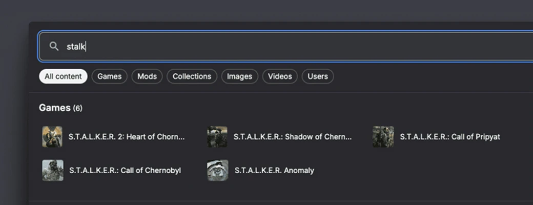
We know that many of our long-term users often use “shorthand” nomenclature when discussing the games they are modding, like SSE, FO4, BG3, etc. We have added an expandable system that allows these shorthands to be accounted for as rapidly as needed. Please let one of our Community Managers know if one of these abbreviations isn’t accounted for, and we can consider adding them to help you find the content that you want.
We recognise that some of you are here for one thing and one thing only. Mods. We will be adding a preference option that lets search default to any of the content tabs, allowing you to customise what content you search for by default in whatever way you want. Once you hit the search results, we are also looking at adding “Title contains”, as an additional search parameter.
Filters and sorting
One of our key goals was to unify our different filtering UIs (filters, advanced search, etc) to make an easier-to-use but more powerful and flexible filtering system for content on the site.
On the old game homepage, we provided a few preset filters to explore, but these didn't always help you quickly find what you were looking for. The new homepage lets you easily combine a sort order and a time range in many more combinations than were previously possible. This includes the "Updated" sort option now applying the time filter based on when the mod was updated rather than the date it was published!
We are working on updating your account settings to give you more control over the defaults you see while browsing.
The full search results page now has the filters on the left side, making it much easier to toggle different search criteria and see the updates in real-time. We have also added a “Show only updated mods” filter, removing mods which have never had an update, which is helpful for games where mods break with every new patch. For example, you can view all mods updated since Stardew Valley 1.6.15 was released by setting the updated date filter to 20 Dec 2025.
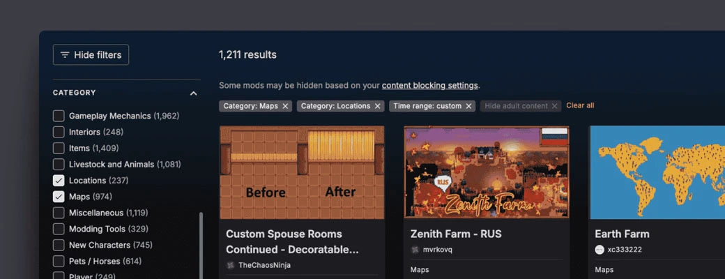
Many of you have asked why our initial release did not include the date range filter. We did not include it in the new designs because it required additional tech requirements to accommodate and our usage statistics showed that it was the least-used time filter by a considerable margin. The call was therefore made not to include it in the new designs.
Following the full launch, we saw that this was a crucial part of browsing the site for many of you. As a result of this, we have released a date filter on desktop resolutions, with mobile views to follow in the future.
Tracked Content Updates
The removal of tracked content updates from the game home page was a deliberate choice. They are clearly useful, but the mods section being on the game page is simply not the right place for them. You could filter your tracked content by game, however, you could not track a game in the same way you can track a mod or author.
We’re aware this tab was used by many users (especially mod authors) to track comments on mods. To offer a more cohesive experience, we plan to reintroduce these updates on more relevant pages e.g. within the Tracking Centre, where they will be more appropriately placed, contextual and useful. This will mean a single location for all tracked content.
Accessibility
We’re sorry to hear that the increased contrast is causing discomfort for a small number of users. We made this adjustment to ensure we meet WCAG contrast guidelines, which we were not previously fully meeting, and are now fully compliant.
Higher contrast helps improve readability, especially for users with visual impairments. However, we understand that very high contrast can lead to eye strain or headaches for some, so we’re actively exploring ways to balance accessibility with comfort. We’ve been working with specific users to see if contrast adjustments can be made while remaining compliant.
We’re also looking into the screen reader issues and will make subsequent improvements here.
Collections
Collections have been a huge boon for many modders, offering an easy way to discover and enjoy curated loadouts. They play a key role in driving downloads and the continued success of Nexus Mods, while also directly benefiting mod authors through our rewards programme. Well-made collections make modding easier for more people and are used by a significant number of users, as such we feel they are highly relevant content for game home pages.
However, we understand that collections may not be relevant to all users. We recognise that not all games benefit equally from collections, and we’re working to adjust their visibility. Soon, collections will only appear prominently if a game has a substantial number of them with a high success rating (75% or above). This change will help balance exposure while ensuring quality. We’re exploring additional options for users who prefer to focus solely on particular content. While we don’t have a specific setting to hide collections right now, we’re keeping this feedback in mind as we continue refining the site.
Performance
We’ve been working on performance on the new pages, both in terms of browser performance and performance directly from the server. It’s not all good news; some of the pages have suffered performance issues and needed fine-tuning.
We are actively monitoring the response times for page loads across all users on the site to ensure that the site hasn’t slowed down. Right now, some of the pages are on par with the old versions, while other pages are showing improved performance.
Here are some representative usage statistics of 24h of site usage and page performance that those users are getting (the average p90 response times across page load and API requests.)
- Games page 8.44M hits, 0.34 seconds
- Per game landing pages: 2.89M hits, 0.38 seconds
- Per game mods page: 4.02M hits, p90, 0.39 seconds
- 30.38M search queries
We have removed many of the CSS Blurs, including the mod tile images. While we thought these blurs looked good and provided a consistent experience for mod images that had irregular aspect ratios, they were affecting performance. These changes should improve performance drastically, particularly in Firefox and non-GPU-accelerated browsers.
Our site response times outside peak hours are acceptable and are similar to the old framework. We are looking at some changes to caching and ways we can optimise requests to the server where possible. We have made some more nuanced changes where we are structuring the data differently or moving it into the search cluster on a case-by-case basis.
We will continue to monitor issues that users have and work to ensure the site is fast and reliable.
In Conclusion
This has been a project of passion for us as a team, and we are incredibly excited by the opportunity to keep improving your modding experience. We realise this was a big thing to drop on you, probably the largest recent change to the website. This update enables us to make improvements more easily, based on better data and your ongoing feedback.
We appreciate that some parts of your site experience have changed that you did not want to change. Our goal is always to balance improvements with continuity. We have taken your feedback on board and will be making several updates as a result. We also hope that you can give this update a chance and see some of the improvements that have been introduced whilst we continue to refine what we have built based on your valued feedback.
Our next monthly roundup will include a full list of the future work we’re committed to, and it will be published later this week.




333 comments
New UI - Accessibility feedback
New UI - Aesthetic feedback
New UI - Performance feedback
New UI - Time filter feedback
I would revert back to the old design with this new aesthetic look. Work your way from there with feedback and discussions in house. Preserve the sanity that is left in these folks, theyre just going to drain yours if you dont listen.
The team have managed to blend feature richness with ease of use. The UI is friendly and simple to use with the option for more advanced searches and queries being nothing more than a scroll away.
If anyone is struggling to use the website as is, I'd recommend they stick to the top of the page or use a few more modern websites and web applications to familiarise themselves with efficient UI's (yes I'm telling you to touch digital grass beyond the Nexus horizon)
Reading through these replies, it looks like people just want to complain for the sake of complaining, they want to stand out, they want to be on the other side of whatever is new and I get it, with Twitter, Facebook and Instagram being so over saturated, it's hard to find a voice on the internet, so when in doubt, come to a social place with fewer members, that way there's a better chance that someone will hear that you hate something! =)
In all seriousness though, good job Nexus, the site looks gorgeous and the face lift was well needed, don't get bogged down fighting an argument that just exists for the sake of it. Compared to the previous site, if you tally up the features, the level of accessibility, load times on mod page stacks, the visual appeal of the site, the new update takes the cake. Thank you again!
I was one of several authors that pointed out this loss of functionality and am glad to see that there's a plan in place to restore this. I agree that the old game-specific "tracked content" tab didn't scale well when I wanted to track comments across several different titles. I look forward to seeing the revamped tracking center.
As mentioned above, I hope that the layout / tile spacing can be improved further from the current state, but I will say that the default sort/hierarchy on mod pages seems like a marked improvement. With the old UI, oftentimes already popular mods dominated the front page for some titles, leaving little room for newer or more recently updated mods to get noticed. With the new UI, it appears that newer and recently updated mods have a more prominent placement.
I still think there's a lot of mods that get "lost in the shuffle", but i'm hoping that with this (and hopefully further) improvement(s), more underrated mods can be discovered by (casual) users.
Mod discoverability is definitely being looked at as a priority.
Several other changes have gone live today to update the quick search and comment search has also been returned today. Many more things are planned.
Tomorrow our main monthly roundup will go out detailing this planned work.
The current comment search as of April 2, 2025 (i.e., today) is completely UNacceptable. Why? Because original posts with queries are displayed/listed separately from the corresponding replies to the original post. This means that queries and corresponding replies appear on different "search page results." But now, there are always 10 search results on one search page. Fatal for an original post that has received a reply, as no connection can be established.
Example website: Nether's Follower Framework - NFF
Search term "horse" - 262 comments on 27 pages.
Original post @AnnikaMikomo from January 8, 2025, 12:07 PM on search page 7 - corresponding reply @bacsie from January 8, 2025, 5:44 PM on search page 9 (no connection can be seen).
This is not an isolated case. Of course, there will be questions (posts) that never received a response. But this creates the impression that my "reply posts" are an "original post" – which is also distorted, as it looks like a monologue.
Please restore this as soon as possible in a correct and understandable manner.
thank you
We can't display the parent and child relationship between comments right now but we're looking at possible solutions to this. I hope you'll agree it's more acceptable to have e the ability to search comments at all than not!
Even searching the page was possible, albeit a bit cumbersome, using the "standard search function CTRL F" and a search term – but reliably recognizable word for word and in context.
Comment searching was impacting the performance of the entire site and needed to be updated.
We want a functional comment search for users, why would we not?
Sorry if you are having issues and the update is not rolled out according to your expectations.
The work that needs to be done, will be done, and copy/pasting your comments multiple times into this news post and forums doesn't speed matters up.
Please provide an option to change to the old UI!
It's not simply that it's more familiar to work with, it's that the new one is absolutely atrocious and MUCH worse to use (and look at) than the old one.
There is an entire thread of paying people who have *begged* you to restore the old look because nothing about the new ui is acceptable.
While I can appreciate the work put in and the direction you want to go - this is awful. Give us the option for the old ui.
Change is awful. Stop it.
People are funny in that they are the most adaptable species on the planet, but the least likely willing to change.
¯\_(ツ)_/¯
Also the Recent Searches is totally useless. I would expect to get what I searched for (for example shadow mods for Cyberpunk) but instead I get a result with ALL the content on Nexus containing shadow.
And the dividing of the top bar to a left and right part while everything below that is centred, is just illogical and dumb. Sorry, don't have another word for it.
Cyberpunk mods containing "shadow"
In your settings you can change the default quick search category to "mods" if useful.
The link you gave is also an example of that: totally not easy to see, going the whole time from left to right in rather big jumps.
A normal easy to read/watch list was great.
Bringing these pages across to our new framework means it's much easier for us to keep iterating on features.
1. I understand exactly why you are doing this
2. I think you're making a really good job of it.