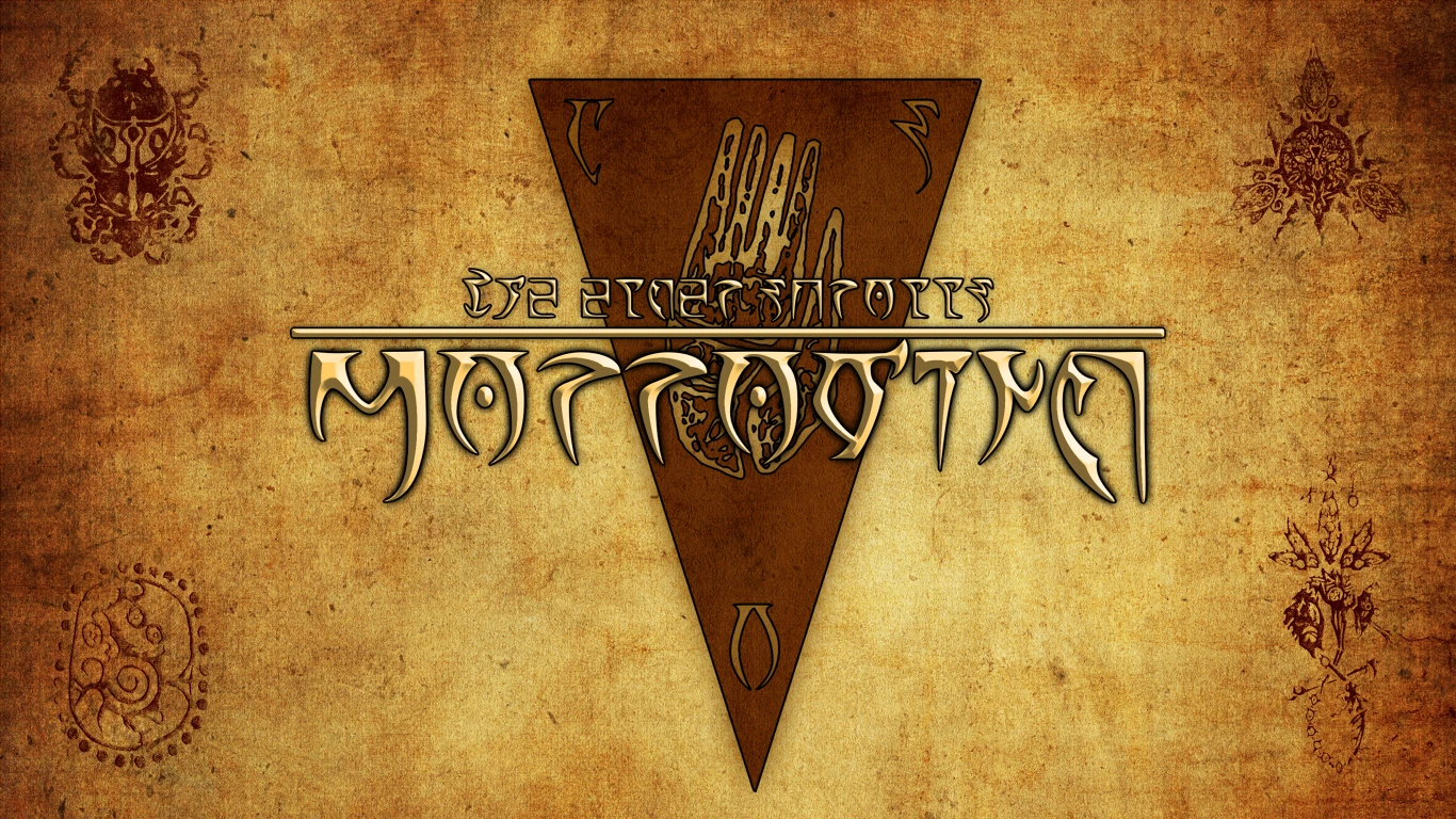
Work in progress - de-outlandered main menu

Image information

Added on

Uploaded by

RedFurryDemon

About this image

The amount of n'wah stuff in the main menu has been bothering me for quite a while.

For now that's just for personal purposes - and it needs a lot of improvement. The worst thing now are color adjustments - there's way too much contrast between the Temple sign and the background, and not enough contrast between the writing and the background; the text should be more visible. However, I'm quite happy with the current progress.

4 comments

  1. Leyawynn
    Leyawynn
    • premium
    • 116 kudos
    The drop shadow and foreground text also dont look quite right, too cartoony.
    1. RedFurryDemon
      RedFurryDemon
      • supporter
      • 69 kudos
      Thanks for the feedback! The style of the writing is based on OgreOgre's menu replacer (original mod is down), as I've been using it for some time and I quite liked it (aside from outlander content). However, this does not look as good with my current background, so I'll need to find a way around that. The shadow and outline are mainly supposed to help make the title more visible, though the shapes, colors, opacity, and other stuff desperately need major changes and adjustment.
  2. Leyawynn
    Leyawynn
    • premium
    • 116 kudos
    Where's the hlaalu and dagoth symbols?
    1. RedFurryDemon
      RedFurryDemon
      • supporter
      • 69 kudos
      Hlaalu work with the Empire, and Dagoth are a bunch of mutated morons. Neither deserve to have their crests included here.