Fallout New Vegas
For The Love Of God Someone Make A Better Hud Texture

Image information

Added on

Uploaded by

Radioactivelad

About this image

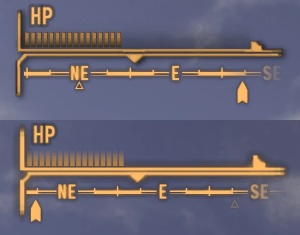
I hate editing textures. I don't understand why the colors look muddy because the texture image is clean. It's unseen here, but even though I copied the HP bar lines over to the AP bar lines, they look different in-game. Same deal with the lines bracketing the HP bar and compass.

Please, somebody beat me to the punch and make this mod instead of me.

I am pleased with how my Bar Ticks turned out, all being said.

6 comments

  1. clayvn
    clayvn
    • supporter
    • 268 kudos
    Vanilla HUD cleaned
    1. Radioactivelad
      Radioactivelad
      • premium
      • 184 kudos
      Nope. Looks ugly.

      It's cleaner but the stylistic changes are terrible.
    2. ItsMeJesusHChrist
      ItsMeJesusHChrist
      • premium
      • 532 kudos
      Like what?
    3. Radioactivelad
      Radioactivelad
      • premium
      • 184 kudos
      I was actually thinking of Vanilla Hud Remastered (I hate your mod's fonts, but they're optional.)

      Anyway, "better" wasn't the right word. I want a hud texture that's more tactile than vanilla's clean lines; texture and "lighting" to make them stand out more, because I'm sick of minimalism. My meter pips are a good sample of the style I'm aiming for.
  2. ItsMeJesusHChrist
    ItsMeJesusHChrist
    • premium
    • 532 kudos
    That's what I am trying to do. 
  3. vaanknight
    vaanknight
    • premium
    • 803 kudos
    That happens when you don't remove the black background from the RGB channels in the dds file. If you check your alpha channel, you'll see it looks like it should glow in-game, but that glow outline is BLACK in the image. If you want a crisp UI, you have to either remove the glowy aura in the alpha, making the icon solid and with no black shadow; or color the ENTIRE RGB channels white so the icon shows up with a soft, non black glow that looks exactly like in the alpha channel. Of course,  no one does that because you lose visibility without the black shadow (ever tried to watch a subtitled video with shadowless subs? screen goes white and you can't see a damn thing).

    Also you have to edit the main menu xml if you want a high resolution image instead of the tiny vanilla 256x256 icons.