Skyrim
LUTy Two-Shoes

Image information

Added on

Uploaded by

napoleonofthestump

About this image

Notice

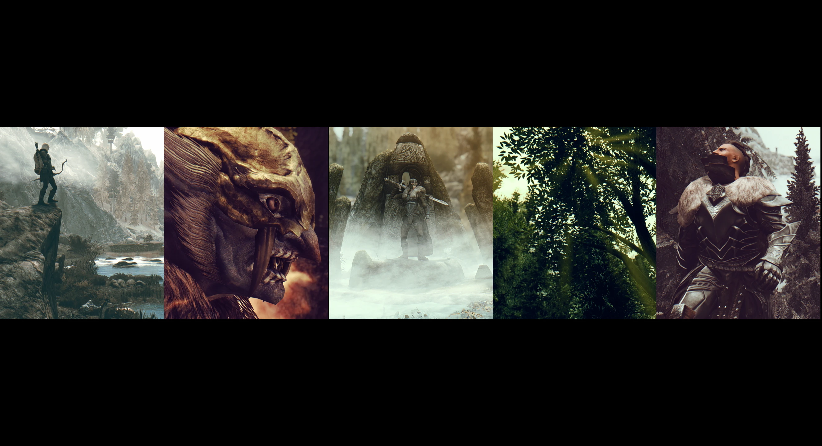
This user's image description contains 28 images. Some authors like to showcase more of their work in their image descriptions or use the image description to provide a storyboard for the image provided.

You will need to be logged in before you can see this user's image description.

23 comments

  1. Gunterping
    Gunterping
    • member
    • 93 kudos
    All look amazing, I could not choose favorite but sure I can picture various scenarios or themes I would use each of them, You have a whole extend in color and temperature so feel you did awesome job havign all this gama to work with in different ways each unique to the other and giving something different. Idk I just like playing with lut's in my shots to fit the mood and atmosphere I want and feel this Lut's are like a toy box for shots, great job man.
    1. napoleonofthestump
      napoleonofthestump
      • premium
      • 543 kudos
      Thank you; you must be the person these I designed these for! I do the same thing, so more variety is always nice to have on hand to play with. While I love the stock Snapdragon LUTs, and I love what Caffeine has done for them, they're all pretty weighted towards the dark end of the tonal spectrum. Been looking for something with chunky blown-out highlights like you sometimes see the Fallout 4 artists use, and finally decided to just make those options my own damn self. Once I get them all as good as I can, I'll release the set out to all y'all.
    2. wolfgrimdark
      wolfgrimdark
      • premium
      • 880 kudos
      Aye I have been hoping you would release something :)
  2. wolfgrimdark
    wolfgrimdark
    • premium
    • 880 kudos
    Excellent looking set I must say. There are some that stand out that I definitely like in color tone but this kind of thing tends to need to be seen in-game, full screen, under different lights, weather, locations, and time of day. I still really like that one from the previous post best.
    1. napoleonofthestump
      napoleonofthestump
      • premium
      • 543 kudos
      Thanks! Totally, the in-game version always looks a little different. I've been using the LUT from that dragon-head-bone shot, Parchment, as a base for future experimentation as the tonal balance in that one looks pretty much spot-on. Like the stock Snapdragon LUTs, only a couple of these will be genuinely useful in all situations. Some are better indoors than out, some in the fog, some in the snow, some at night, etc. but I reckon that's just the nature of final-pass color grading, whether done with LUTs, acetate filters, or magic markers.
  3. wadelycan
    wadelycan
    • premium
    • 79 kudos
    Great looking shots. Whichever one this is is my favorite
    1. napoleonofthestump
      napoleonofthestump
      • premium
      • 543 kudos
      Thanks! From where it is in the order I think that's Cicada. Recently rejigged that one to make the highlights a little less yellowy, but it's still got that saturated, cheerful character.
  4. Xorp
    Xorp
    • premium
    • 50 kudos
    Need post processing.... need pos....... they are already insanely good looking!

    Your cinematic effect is so gorgeous
    1. napoleonofthestump
      napoleonofthestump
      • premium
      • 543 kudos
      Ha, thanks! There are a couple of things I'd definitely change in post, but I rather like how these came out. Granted, I took a bunch of shots and most of them were pretty crap, but that's the way it always goes.
  5. BlackMaid
    BlackMaid
    • premium
    • 330 kudos
    I really like the diversity of your peronal luts ... my favs here Grandad, Coldbrew, Homestead, Marble and Zebra ... but the others too ... there are more examples necessary to say it more exactly
    1. napoleonofthestump
      napoleonofthestump
      • premium
      • 543 kudos
      Thanks, kind of you to say! Some tweaked versions and some brand new ones coming soon...
  6. Klaxoid
    Klaxoid
    • member
    • 193 kudos
    I love the blues and the oranges with the desaturation.

    This shot is probably my favorite Reikling shot of all time
    1. napoleonofthestump
      napoleonofthestump
      • premium
      • 543 kudos
      Ha, thanks! I really like how that one came out, too. Glad you like the blue/orange combos. I tend to favor that complement pair, and in some of these LUTs I turned it up about as far as it could go!
  7. Simboker
    Simboker
    • supporter
    • 73 kudos
    This is my favorite, the lighting in combination with the colors is awesome, as well as the motiv of the image.
    1. napoleonofthestump
      napoleonofthestump
      • premium
      • 543 kudos
      Thanks! I like ensemble shots, but I rarely am lucky enough to capture actors in motion at an opportune moment, and haven't the patience to individually pose everyone in a scene. I could see that this fracas would result in something neat (eventually) so I just kept freezing and jigging the camera around until I got a couple of nice compositions.
  8. Isoldmymom
    Isoldmymom
    • supporter
    • 1 kudos
    Awesome screenshots! Could you please share your LUTs if you don t mind? :d
    1. napoleonofthestump
      napoleonofthestump
      • premium
      • 543 kudos
      Thanks! That's the plan. Once they're as good as I can get 'em and I figure out the permissions, I'll be putting together a release.
  9. SomewhatWindy
    SomewhatWindy
    • premium
    • 148 kudos
    Very cool set and I really like you experimenting with the Lut,.. I find it hard to pick a favorite, although Parchment and Homestead stand out for me,....
    I also find it a bit harder to judge because the cinematic bars make the viewing experience very nice,.. but really seeing what's going on full screen is a bit harder to see (atleast for me) .
    Your angles and compositions are great though,.. would not change a thing in that regard,..
    1. napoleonofthestump
      napoleonofthestump
      • premium
      • 543 kudos
      Thanks Erwin! Parchment is just about perfect, and Homestead is getting there with the latest tweaks. I hear you on the wide-ass borders- but I'm not likely to change my style any time soon. Mostly because I've come to really enjoy the miniaturizing effect it creates, like a Cornell box.
  10. Yfr
    Yfr
    • member
    • 38 kudos
    Stunningly beautiful work. Every image is unique and superbly composed.

    As for personal taste, if we are talking about the ENB? I am tired so forgive me if I missed the point entirely, lols.
    To my eye could use more contrast indoors, and one shot of the mohawk guy standing in the forest on the hill could use a bit more too.
    As for color, maybe a touch less somber on the one where he is running, and where the guy is riding the horse up to the tower and the following wolf shot. The last two shots are a bit monochromatic heavy, but I'm guessing that was intentional.
    And just a personal thing, most may not agree, but I like less dof in distant backgrounds.

    I'd use it even as it stands and be damned happy after just adjusting the dof, if my old compy would just agree to it. But there I might run into... issues, lols.
    1. napoleonofthestump
      napoleonofthestump
      • premium
      • 543 kudos
      Thanks. I was specifically referring to the LUT part of the ENB (hence the title, and all the words and stuff). The whole idea of LUTs is that they provide different (sometimes dramatically different) color grading to the image. If an ENB includes the ability to swap out LUTs on the fly, as Caffeine and Snapdragon do, the idea is that folks will change up their colors as they feel the yen, rather than sticking with a single color scheme for every shot or scene. That being said, I do hear you on the apparent lack of contrast in some of the shots. While that was the result of a deliberate choice to lift the shadows, the red grading of the shadow colors is a bit 'bright' even to my eyes. In any event, thanks for chipping in!