About this image
Notice
This user's image description contains 30 images. Some authors like to showcase more of their work in their image descriptions or use the image description to provide a storyboard for the image provided.
You will need to be logged in before you can see this user's image description.


6 comments
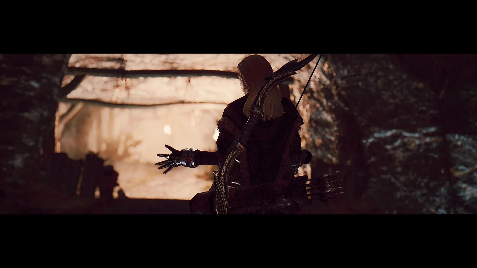
Embershard mine is on my list of things to mod, eventually.
Nice set, Rick :)
Then Caffeine ENB was released, the follower to Antique Dragon ENB, and I just had to test it. Caffeine was more toned downed compared to the majestic AD, so it looked like something I would like. The exteriors didn't really grab me at first, but as soon as I went indoors or down a crypt/ruin/mine/whatever, the sharpness, the details and the lighting just blew me off the chair. It looked so gorgeous!
So I had a bit of a personal debate for a while between either Rudy (better exteriors) or Caffeine (better interiors) until napoleonofthestump emerged out of nowhere and presented his mod RevoLUTion which added a lot of different LUT's. It was based on Caffeine, but I was still sceptic. Some of them just looked too overexposed, washed out and such. Once I saw his images though, with the LUT's, I saw a whole new angle of this whole screenart hobby. So I tested the LUT's with Caffeine...and I've been stuck with them ever since. Along with the once included in Caffeine, I have 57 LUT's to pick from and they all pretty much look different. It really did revolutionate my screenarchery which is interesting considering my feelings about such images before (those with too much contrast). Now I feel as I'm re-discovering every place in Skyrim again with so many possibilities and it's brought back so much joy about snapping shots from this game. I realise LUT's are not for everyone - I've been there myself, disliking them even - but I'm having a blast!
Thanks and sorry for the long recap!
Not that I don't like or appreciate more artistically skewed takes on it, mind you. I think filters can evoke moods and feelings from both the piece and from the viewer that just aren't possible otherwise.
Keep doing what you do, Rick, I love looking through your sets :)