As you know, we're hard at work on the new website for Nexus Mods and want you to see exactly what we’ve been up to—what we've implemented, improved, fixed, and what we're still working on.
Below, you’ll find our updates for May. This month, we’ve focused on a bunch of enhancements and fixes to make your experience on the site even better.
Now, let’s dive into what’s new and improved:
User Profile Tweaks
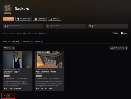
You've been giving us some great feedback about the new user profile page, thank you! Based on the most common points raised we've made the following refinements:
- No More Infinite Scroll: This was a big one. There was an overwhelming response to this, so we listened and we’ve switched back to page-based navigation.
- Auto-Applied Filters: Game filters now auto-apply when you visit a profile from a game page.
- Faster Performance: Profiles load quicker now, though we're still ironing out some ad-related slowdowns.
Better Navigation
We’ve improved the navigation on the newer parts of the site for a more consistent experience. It now matches the main Nexus Mods site and includes:
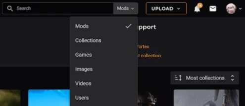
- Search: Find Mods, Media, Games, Users, and Collections effortlessly.
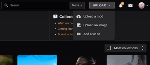
- Quick Uploads: Direct shortcuts for uploading Mods and Media.
We’ll be continuing to work on this over the coming months, as our goal is to get as much consistency as possible between the old navigation and the new navigation. Something else to be excited about is our plans to expand the range of games you can favourite.
Improved reporting and moderation tools
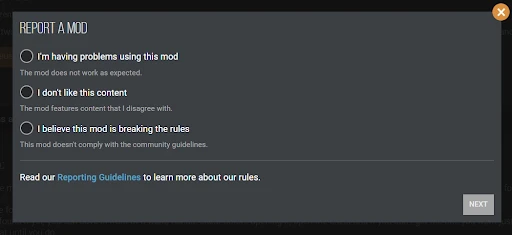
We've updated the reporting pop-ups for all content types so that they now prompt for key information that will help our moderators handle your report more quickly and effectively. The new pop-up window also features advice for users in cases where they would be trying to report a mod for the wrong reasons.
On top of this, we're working on improving the tools for moderators behind the scenes to make it easier to handle reports and protect the community from abuse.
One Login to rule them all
Remember how annoying it was to have to log in to Nexus Mods, and then log in again for collections, and again for your profile, and again for...well you get the idea. Now, when you log in or out of Nexus Mods, you’re also logged in or out of our subdomains. So, whether you’re on Collections, User Profiles, or any settings page, one login does it all.
And more…
- Donation Points Updates: Updated Rules and FAQs: Check out the new rules and FAQs for our Donation Points system in our latest news post. We’ve also cleaned up some old FAQs from the Wallet section and added a notice about delayed monthly reports.
- Out with the Old: We’ve ditched an outdated ‘About’ page. You can find the latest info here.
- Quick Alerts: We can now toggle a site-wide banner on and off to keep you informed about important issues, usually covered on our status page.
- Collection Revision Errors: No more errors when checking out old collection versions.
- Pinning/Hiding Collection Comments: Collection curators can now pin or hide comments without any hiccups.
- Avatar bugs fixed: Avatar issues? Gone. You can add, update, or remove your avatars smoothly.
- Redirect bugs: Those pesky “redirect errors” some of you were seeing? Fixed.
- Profile View Count Fix: View counts are now more accurate and won’t increase when you view your profile.
- Legacy Username Fix: No more errors for users with spaces or special characters in their usernames.
What are we working on next?
Now that you’re up to speed with everything from May, here’s what to look forward to in the coming months:
- A brand-new payment system is in the works, which you can read more about in our recent news post.
- An early alpha release of the Nexus Mods App, featuring support for Stardew Valley.
- We’re adding even more enhancements to our moderation tools.
- We’re making changes to the way the Donation Points system works.
- Search for comments on mod pages (we know this was mentioned a while ago, but we wanted to acknowledge this is still in the pipeline and hasn't been forgotten!)
- Navigation alignment (game-specific links, favourites, etc.).
- Investigating an issue where deleting images from your profile wasn’t working.
- We’ve been moving our downloads database infrastructure due to changes with our provider.
- Our design team is cooking up some refreshed fonts for the website. Stay tuned!
Your feedback is super important to us and really helps shape our future improvements. You’ll notice we’ve already made some changes based on what you’ve told us, so please keep the suggestions coming!



106 comments
Comments locked
A moderator has closed this comment topic for the time beingI'm looking forward to the new NMA and would really love am opportunity to join the volunteer testing team once that opens up. Please keep me in mind! <3
Also related to comments... there's no plans to track our comment history yet? Something like Steam's comment history. Nexus had a forums comment history and it was very useful regardless of how clunky it was.
There are no plans to deliver a comment history tracking this year. The request is in our backlog and we will get to it, but right now we're focusing on other projects (like the ones mentioned in the article).
We have a lot of projects that we'd like to do and that everyone is asking for, but we can't do everything at once sadly. We're having to make hard decisions to focus on a few projects that we can deliver.
I think you've misunderstood. No, mods do not need to be recreated or updated to work in the Nexus Mods App.
Xaliber13 is asking about a migration tool. I.e. take your stable mod setup on Vortex and move it to Nexus Mods App. We aren't planning on creating a migration tool for the Alpha release, so you will need to start from a clean game install and then reinstall your mods.
Does that mean people who are developing their modlist will need to redo their modlist from scratch, if I understand it correctly? How would Collections work pertaining to this? Can we "backup" our modlist to Nexus Collection, and then recover it back to NMA/Nemo later?
I understand that NMA/Nemo will only be in its very early alpha stage this year. But if migrating tool is not in the horizon yet, I imagine that the need to rebuild our modlist (a daunting process already for Skyrim) will make a lot of people would just migrate to other tools (like MO2) instead of to NMA/Nemo.
Kinda like if you manually add mods to a game and Vortex doesn't recognize them or even acknowledge their existence
Bom dia!
Gostaria de dar algumas Sugestões...
01- Em “Melhor Navegação/Pesquisa”…
- Adicionar na Pesquisa: Arquivos “Translate Mod + País (XX) do Usuário” para aliviar a Pesquisa por paginação de Mods.
- É sabido que as Traduções de Mods, superam o número de Mods hospedados na NexusMods, causando +5x o volume da Pesquisa. Se em uma Categoria existem 50 Mods Originais, as Traduções chegam a 250 Mods, a mais, para ser Pesquisado pelo Usuário por paginação.
- Esse tipo de Arquivo já está ligado ao Mod Original, na página do Mod. Não faz sentido o Arquivo Translate aparecer na Pesquisa junto do Mod Original.
- Se o Usuário quer Pesquisar Arquivos Translate, é só digitar “Translate + País (FR/BR/PT/DE/IT/ES)”, que a Pesquisa vai lhe mostrar Todos os Mods com essa Tradução.
- Também seria interessante adicionar na Pesquisa (no caso de Mods Skyrim): A “Versão do Mod”, pois Skyrim tem várias versões como, Legendary (até ???), SkyrimSE (até 1.5.97), SkyrimSE + Aniversary (até 1.6.1170) e Aniversary (a partir de ???).
- Para Pesquisar: é só selecionar a página Categoria/ e escrever no “Box da Pesquisa” o “Número da Versão”. Assim, todos os Mods dessa Categoria, serão mostrados com a Versão Escolhida pelo Usuário.
- Esse tipo de Pesquisa ajudaria o Usuário ter a certeza se o Mod funciona na sua Versão de Skyrim ou não.
02- Essa Sugestão é para os Pais que estão, constantemente, pedindo para a Administração da NexusMods, para bloquear Mods Pornográficos/Adultos, evitando problemas com a família.
- Atualmente tem duas opções bem interessantes: - Um pop-up alertando o Usuário de conteúdo Pornográfico/Adulto; - e um outro, deixando as imagens nubladas no momento da Pesquisa.
- A Sugestão seria adicionar, as sugestões que já estão em vigor, um “Botão Ignorar” (como existe no Site da Valver), dentro das páginas dos Mods, em geral.
- Esse “Botão Ignorar” seria igual ao “Botão de Pesquisa”. Ao Ignorar um Mod, o Usuário teria que escolher um Motivo que justifique o “Botão Ignorar”.
- As opções no momento seriam três: - Mod Pornográfico/Adulto; - Mod Descontinuado; - Mod Desatualizado. Ao Ignorar um Mod, ele não aparece nas Pesquisas e nem nos Anúncios para esse Usuário.
- Como seria o seu funcionamento?…
- Ao adicionar um “Botão Ignorar” na página do Mod, também seria adicionado na página do Usuário um “Histórico”. Em cada linha teria, “Box de Seleção + Imagem + Nome do Mod” + Data + Atualizado.
- O Mod Pornográfico/Adulto, ficaria no rodapé da página “Histórico”; O Mod Descontinuado, ficaria acima do Mod Pornográfico/Adulto; e o Mod Desatualizado, ficaria acima do Mod Descontinuado, porque esse tipo de Mod Desatualizado, ainda poderia ser atualizado pelo Autor do Mod, e o Usuário, poderia desfazer a seleção o “Box de Seleção” e colocar o Mod na Pesquisa novamente.
- Muitos Mods Descontinuados tem a sua última versão atualizada. Se o Usuário não se interessar por essa versão, então deveria Ignorá-lo, polpando assim, ter esse Mod na Pesquisa.
Obrigado pela atenção
---
Hey!
Good morning!
I would like to give some suggestions…
01- In “Better Navigation/Search”…
- Add to Search: “Translate Mod + User's Country (XX)” files to ease Search by Mod pagination.
- It is known that Mod Translations exceed the number of Mods hosted on NexusMods, causing +5x the Search volume. If there are 50 Original Mods in a Category, the Translations reach an additional 250 Mods, to be Searched by the User via pagination.
- This type of File is already linked to the Original Mod, on the Mod page. It makes no sense for the Translate File to appear in the Search alongside the Original Mod.
- If the User wants to Search Translate Files, just type “Translate + Country (FR/BR/PT/DE/IT/ES)”, and the Search will show you All Mods with that Translation.
- It would also be interesting to add in the Search (in the case of Skyrim Mods): The “Mod Version”, as Skyrim has several versions such as, Legendary (up to ???), SkyrimSE (up to 1.5.97), SkyrimSE + Aniversary (up to 1.6.1170) and Anniversary (from ???).
- To Search: just select the Category/ page and write the “Version Number” in the “Search Box”. Thus, all Mods in this Category will be shown with the Version Chosen by the User.
- This type of Research would help the User to be sure whether the Mod works in their Version of Skyrim or not.
02- This Suggestion is for fathers who are constantly asking the NexusMods Administration to block Pornographic/Adult Mods, avoiding problems with the family.
- Currently there are two very interesting options: - A pop-up alerting the User of Pornographic/Adult content; - and another, leaving the images cloudy at the time of the Search.
- The suggestion would be to add, to the suggestions that are already in effect, a “Ignore Button” (as it exists on the Valver Website), within the Mods pages, in general.
- This “Ignore Button” would be the same as the “Search Button”. When Ignoring a Mod, the User would have to choose a Reason that justifies the “Ignore Button”.
- The options at the moment would be three: - Pornographic/Adult Mod; - Discontinued mod; - Outdated Mod. When Ignoring a Mod, it will not appear in Searches or Ads for that User.
- How would it work?…
- When adding an “Ignore Button” on the Mod page, a “History” would also be added to the User page. On each line there would be, “Checkbox + Image + Mod Name” + Date + Updated.
- The Pornographic/Adult Mod would be at the footer of the “History” page; The Discontinued Mod would be above the Pornographic/Adult Mod; and the Outdated Mod would be above the Discontinued Mod, because this type of Outdated Mod could still be updated by the Mod Author, and the User could undo the selection in the “Selection Box” and place the Mod in the Search again.
- Many Discontinued Mods have their latest updated version. If the User is not interested in this version, then they should Ignore it, thus skipping this Mod in the Search.
Thank you for your attention
(translate google)
.
Bom dia!
A necessidade de um Motivo seria para organizar o histórico na página do usuário.
Caso o Motivo fosse por Desatualização do Mod, assim que o Mod por atualizado, será marcado uma atualização, como ocorre no vortex.
Então o usuário decide se retorna com o Mod para as pesquisas ou não.
Nota:
As tags: - Mod Pornográfico/Adulto; - Mod Descontinuado; - Mod Desatualizado, seriam responsáveis pela organização da página histórico. Sem essas tags, o histórico do usuário ficaria misturado.
Obrigado pela sua atenção
---
Hey!
Good morning!
The need for a Reason would be to organize the history on the user's page.
If the reason was due to the Mod being outdated, as soon as the Mod is updated, an update will be marked, as occurs in the vortex.
Then the user decides whether to return with the Mod for research or not.
Note:
The tags: - Pornographic/Adult Mod; - Discontinued mod; - Outdated Mod, would be responsible for organizing the history page. Without these tags, the user's history would be mixed up.
Thank you for your attention
(translate google)
.
- Please add shortcuts to Delete and Mark as Read in the notifications page
- When deleting notifications one after the other, the deleted notifications just pop up again, most of the times, can it be fixed?
Perhaps placing a directly visible Updates Tab with cover screenshots and short description, or better yet a timeline in the spirit of social networks (or blogroll, whatever is easier to implement), with priority to content and authors that a user tracks... This issue has been requested to be addressed by many community members, creators and users alike (I as a user of other authors content would very much appreciate this).
You can set this as your default tab in your site preferences too by using the 'Default Mods Tab' setting.
Maybe Nexus could make it so that updated mods will also show up next to (or under) new mods on the same page, increasing their visibility? And not just kind of hidden away in the 'Updated' tab. The stats on many mods will show you that they get the most views when they are in the 'New today' tab, so maybe combine the two (Updated and New) into one, if possible?
And maybe remove the Media section if there is not enough space to combine them. It's mostly softcore porn in there anyway, I'd rather see more mods.
Making mod updates more visible for users by default (lets face it, very few would bother changing their site preferences for this) would solve a lot of issues that's been brought up about modders uploading updates as new, separate mods. I feel the temptation to do just that every time as it sucks to post a huge update and it gets almost no visibility.
Then you make the toggle if users want to separate the two.
EDIT: Suggested this in Nexus Feedback.
I'd like that as long as it doesn't end up as useless as the liked video playlist. I think it needs to be capped at a certain number or it could get really messy following 200 people. Imagine how many database queries this site has per sec and then imagine it 200x that.
There really isn't enough real estate on a single page to split it, It's been done before and it wasn't liked having narrow columns trying to give equal visibility and being below didn't help either because it was still largely ignored. I think the layout is very good and all we need is an alternating default view for MORE MODS so that every other time you load the page it defaults to Updates instead of New Today. I think that would be the fairest way for both the new uploader and the recent updater to get maximum visibility.
Also, the visibility of translations should be limited IMO, they could be replaced by updated mods on the main page for example. Sometimes translations take up 50% of the latest mods and it's really annoying. People who want translations can literally search for them, no one's going to download them just because they show up on the main page.
I ran the performance profiler (for Firefox) on the page as you can see here: https://share.firefox.dev/3XduwL5
I can't access the old page to run a comparison, but the slowdown is just insane to me. Every time I interact the renderer hits 100% usage. I could understand if the page was rendering complex 3D models or something, but in my opinion there's nothing on the page to justify such a significant performance penalty.
Bom dia!
Esse problema de Lentidão na sua Navegação, pode ser o seu Brawser Firefox, devido a Quantidade de Anúncios promovido por essa empresa.
Faz um pequeno teste…
Faz o download do Brawser Brave e veja qual dos dois é mais rápido ao Navegar na Net.
O Brave bloqueia Anúncios que causam essa Lentidão.
Faça a sua escolha.
Obrigado pela sua Atenção.
---
Hey!
Good morning!
This slow browsing problem could be your Brawser Firefox, due to the number of ads promoted by this company.
Do a little test…
Download Brawser Brave and see which of the two is faster when browsing the Internet.
Brave blocks Ads that cause this Slowdown.
Make your choice.
Thank you for your attention
(translate google)
.