About this image
Notice
This user's image description contains 26 images. Some authors like to showcase more of their work in their image descriptions or use the image description to provide a storyboard for the image provided.
You will need to be logged in before you can see this user's image description.


11 comments
Jar droped **
As for feedback:
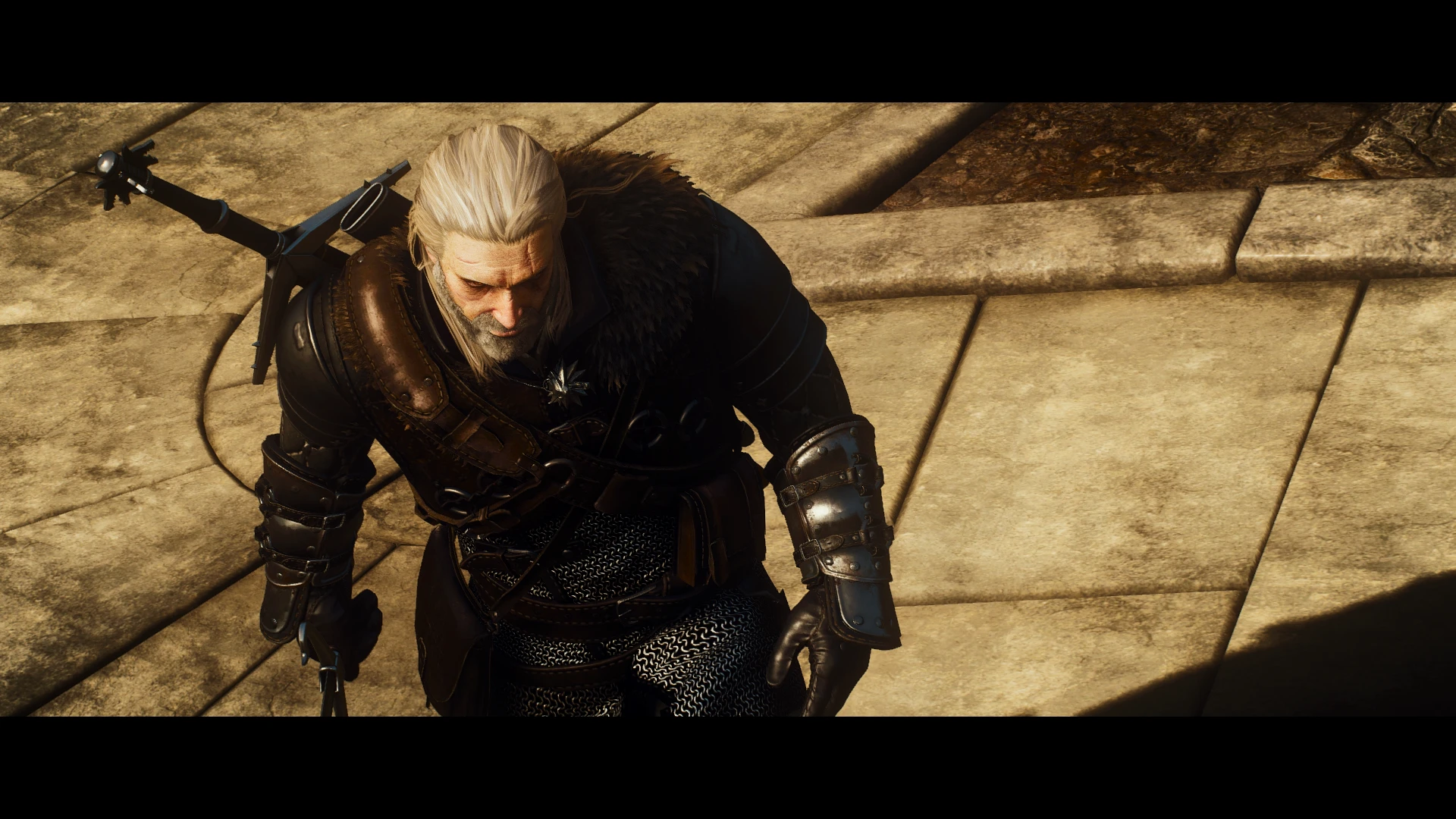
There are many really nice shots here! I like the variation of angles through out, but the top down street shots are especially eye catching. I think the lines of the cobblestone make for some neat compositions. The 'action scenes' with the drowners make for a nice cinematic sequence and in general you've got some nice visual storytelling going on!
I think this image, 6th in the description, of the rocky garden looking thing stands out as a bit of a messy composition though. There doesn't seem to be a particular point or area of interest for the eye to rest on. Part of the reason for that, I think, might be because the lines form more of a grid rather than a guide of sorts. You've got the path and the water making two almost parallel vertical lines leading up and getting blocked by a stark horizontal line, the ridge. From there the eye gets a bit stuck, darting about the image and then up into the sun, which could be intentional, what do I know. If that is the case, then I think it would be better to use just the water stream as a singular vertical line placed in the centre leading up to the sky and light. Alternatively the scene might have worked better if the camera was scooted a bit to either side, depending on the lay of land. Then the path and stream might have gone from corner to corner, taking you across the image rather than sending you up into space.
Also, the fence post/gate is another very distracting line/object. Perhaps that would have worked as a focal point?
This one, 6th from the bottom, however, might be my favourite! Nice composition with the foliage framing Geralt, some particles to add both drama and interest. Really awesome shot and, in my opinion, much more of an interesting character shot than a close up portrait. (Though they do have their purposes, too.)
Right, got a bit carried away there. Apologies. I hope there were some usable points in there somewhere. It's the sort of thing I often end up making myself, messy and confusing compositions, so it caught my eye.
Anyway, keep on making the cool stuff that you do. Always enjoy seeing a post from ye!
Also, I really want to emphasise that that’s the only image I found there was much I could say about. Essentially all the other shots are very nice in many different ways!