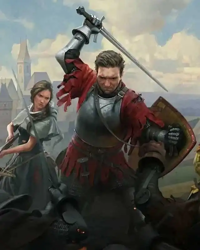
Larger Images so people can see the quality of the MOD, These are taken in 4k, They look stunning in-game, Nexus only allows up to 8 MB to be uploaded to their site directly in the mod images and as such have to be reduced. I have uploaded these online so they may appear in all their majesty.
I am also trying to find the original files and having a hard time. Would you be so kind and help me with the path to the original loading screen art works?
Actually I found them: C:\Program Files (x86)\Steam\steamapps\common\KingdomComeDeliverance2\Data\IPL_GameData.pak\Libs\UI\Textures\Video\
Then I converted them with this website to png files: https://omnifile.co/
So now I can use them as wallpapers. Sadly there is this vignette effect on the bottom of every artwork but otherwise its great!
Imma leave a critic here trying to be constructive for why this mod is not so necessary:
The art style imitates oil paintings and that texture + the kinda crispy image brings the style together. That effect is removed. Appreciate the mod, but it's truly on appreciable on big TVs at 4k or above.
Personally, I was hoping someone would make this mod as I felt the regular version looked very grainy and just not great on my High Fidelity 4k monitor, It now looks like I felt the originals should look. I think the Devs really missed the mark with 4k Integration into the base game.
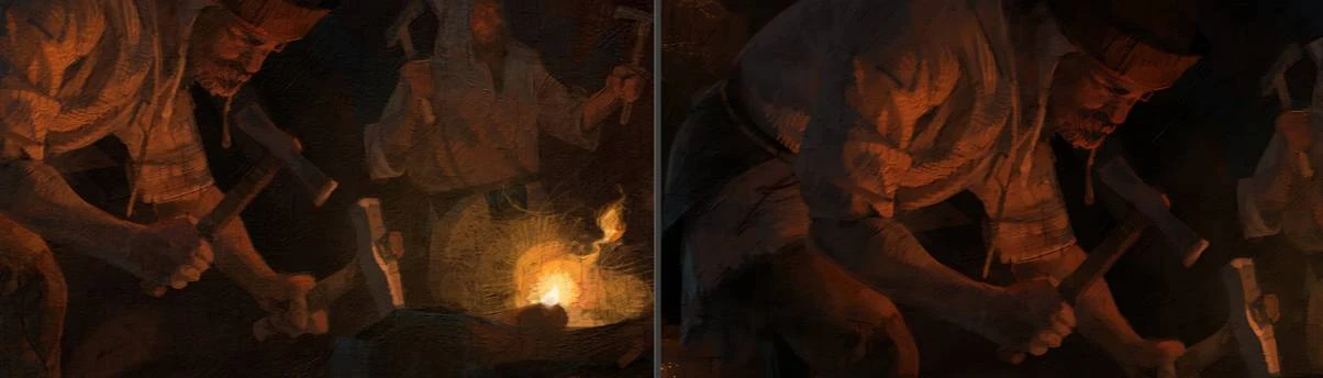
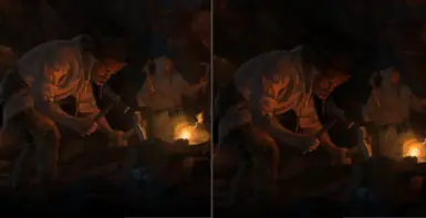
The ai upscaled one looks significantly worse. All the detail from the brushstrokes is gone, and the aspect ratio looks wrong in your comparison pics. This upscale is a good example of how terrible it can look, without the knowledge of what's needed in a high quality upscale. You never ever want to remove detail from the original, you only want to improve it. Look how smooth those 4k colours are, whereas you can see the texture of the paint and canvas in the originals.
It's not an AI upscale, and the aspect ratio is the same. The images just look that way in the editor outside the game. If you don't like it, just move on. :)
I feel like you're trying to tell people how to think. Idk man be more subtle if you want to discuss it without bashing someone's work. Instead, you could ask the author something like, 'Do you think the imperfections of the original make it feel more authentic?' or 'What type of processing did you use?' You don't need to be that rude.
Either way, it's still an upscale. One that quite literally removes details. That's 100% what you need to avoid when upscaling anything. People are permitted to voice their opinions, though I could've been less harsh, I agree with that.
Yes, and modders are allowed to mod – that’s why we’re here, to mod. This is the way I like it, and everyone has the right to an opinion. I didn’t make this to sell it, it's free, and everyone can see if they like it or not. That’s the point of modding. Whether the details are like this or like that doesn’t matter, it only matters if someone likes it or not.
Like usual, you are doing a really good work, your mods are very interesting and well made.
I have a little question tho, since your last updates, I noticed that everything you are upscaling have darker color and contrast, I was wondering if it was a side effect of your upscaling method, or if it was an intended effect that you chose to add?
If the later, do you think you could make alt versions of your mods that doesn't change the contrast and colors, and just upscale the textures and images?
Tbh, I was using your first version of the Icon Rework mod, I was really loving how much better the textures were looking, but now I think it's a bit too dark and that it can kills a lot of details. I don't know if it was already the case in your first version and that I just couldn't tell it right away.
I realize that it adds a lot of work charge tho, and that even without the added work, you could just don't want to do it at all, so I wouldn't blame you at all to refuse it!
Anyway, thanks a lot for all your hard work and all your amazing mods, take care!
I will make a lighter version for each mod. Yes, I intentionally increased the contrast a bit because I personally prefer it that way, and I originally made it for myself. However, I will create a lighter version for every mod, keeping the vanilla contrast. Thank you, my friend!
Thanks a lot for accepting, even tho, like you said, these mods were primarly made for you. I really appreciate it, and I'm sure many other will, you rock!


23 comments
Actually I found them:
C:\Program Files (x86)\Steam\steamapps\common\KingdomComeDeliverance2\Data\IPL_GameData.pak\Libs\UI\Textures\Video\
Then I converted them with this website to png files:
https://omnifile.co/
So now I can use them as wallpapers. Sadly there is this vignette effect on the bottom of every artwork but otherwise its great!
Thanks anyway
The art style imitates oil paintings and that texture + the kinda crispy image brings the style together. That effect is removed. Appreciate the mod, but it's truly on appreciable on big TVs at 4k or above.
This upscale is a good example of how terrible it can look, without the knowledge of what's needed in a high quality upscale. You never ever want to remove detail from the original, you only want to improve it. Look how smooth those 4k colours are, whereas you can see the texture of the paint and canvas in the originals.
People are permitted to voice their opinions, though I could've been less harsh, I agree with that.
You're right about this.
Like usual, you are doing a really good work, your mods are very interesting and well made.
I have a little question tho, since your last updates, I noticed that everything you are upscaling have darker color and contrast, I was wondering if it was a side effect of your upscaling method, or if it was an intended effect that you chose to add?
If the later, do you think you could make alt versions of your mods that doesn't change the contrast and colors, and just upscale the textures and images?
Tbh, I was using your first version of the Icon Rework mod, I was really loving how much better the textures were looking, but now I think it's a bit too dark and that it can kills a lot of details.
I don't know if it was already the case in your first version and that I just couldn't tell it right away.
I realize that it adds a lot of work charge tho, and that even without the added work, you could just don't want to do it at all, so I wouldn't blame you at all to refuse it!
Anyway, thanks a lot for all your hard work and all your amazing mods, take care!