


0 of 0
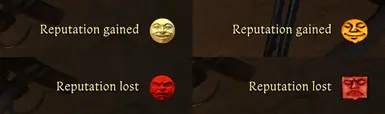


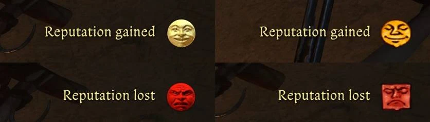
If you're like me, you probably think the new reputation icons look a bit off, like they're staring into your soul, and you miss their original look from KCD1. This mod restores the original aesthetic, while also adding new icons to correspond to the new tiers in KCD2.
KCD1 only had 3 reputation tiers: low, neutral, high, whereas the sequel introduces several new ones: undiscovered, very low, low, neutral, high, very high. I've created new intermediary icons based on the original ones, while very low, neutral, and very high are the same as the first game, only with slightly tweaked colors and saturation a bit to standout from the others more.
The KCD2 icons are arguably easier to tell apart at a glance, but I wanted to preserve the original games look without changing the colors too much. The original style also fits the diegetic feel of the UI better in my opinion. I'm not a digital artist by any means, but I'm happy with how they turned out. If anyone else wants to try their hand at it, be my guest.
Also, before anyone mentions this, I did try upscaling my icons to achieve a crisper, high quality look, but it just looks weird. I can't quite put my finger on it, but the low quality look has a certain charm, and you mostly wouldn't notice the difference in game anyway.
I also have not touched the haggling status icons, which have the same style as reputation in KCD2, but had completely different icons in the first game. I may address that in a separate mod, as those are in the main HUD texture map and would cause incompatibility with other HUD texture mods.
Installation: Drop the OriginalReputationIcons folder in KingdomComeDeliverance2\Mods.
Vanilla KCD2 Icons

Modded KCD1 Style

Modded KCD1 Style
KCD1 only had 3 reputation tiers: low, neutral, high, whereas the sequel introduces several new ones: undiscovered, very low, low, neutral, high, very high. I've created new intermediary icons based on the original ones, while very low, neutral, and very high are the same as the first game, only with slightly tweaked colors and saturation a bit to standout from the others more.
The KCD2 icons are arguably easier to tell apart at a glance, but I wanted to preserve the original games look without changing the colors too much. The original style also fits the diegetic feel of the UI better in my opinion. I'm not a digital artist by any means, but I'm happy with how they turned out. If anyone else wants to try their hand at it, be my guest.
Also, before anyone mentions this, I did try upscaling my icons to achieve a crisper, high quality look, but it just looks weird. I can't quite put my finger on it, but the low quality look has a certain charm, and you mostly wouldn't notice the difference in game anyway.
I also have not touched the haggling status icons, which have the same style as reputation in KCD2, but had completely different icons in the first game. I may address that in a separate mod, as those are in the main HUD texture map and would cause incompatibility with other HUD texture mods.
Installation: Drop the OriginalReputationIcons folder in KingdomComeDeliverance2\Mods.