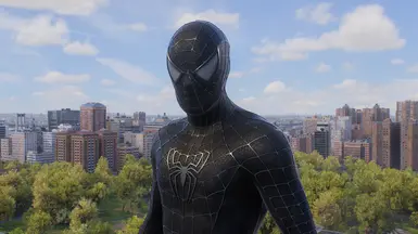
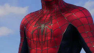
With all the respect, I think most of us don't need any new styles for the raimi suit. It is perfect as it is. Make a good use for your time and do something else.
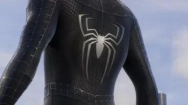
Well in that case. Something inspired by the Amazing Fantasy #15. I really dig the blue back logo. So the style could be dark blue or black and red, with blue back logo. You could add maybe a brushed metal finish to the back logo or something cool like that. Hope it makes sense.
I've been following the updates closely, and wow, your mod has evolved incredibly. I hope you'll release your own version of TAMS1 and its Black Suit soon. Your work is incredible
BrokenWhiskeyGlass, In my opinion, these suits are accurate. I really like how these suits are reworked to resemble their movie counterparts, even if the body proportions aren’t accurate. Personally, I prefer the vanilla body proportions.
"In my opinion, these suits are accurate" and then you say "even if the body proportions aren’t accurate". It's fine if you like insomniacs body model, but it's simply not accurate to the movies, that's a fact.
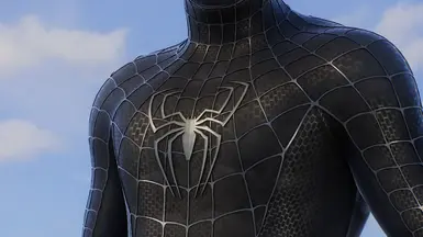
Awesome work, thank you for this! I just noticed some weird hand shapes. Not sure if it's intended, but here’s a comparison with the vanilla hand shape.
Tbh I really like Gothas suit, even compared to Vaders. But the body proportions are off in many spots. Weird fingers, long traps, flat rear delts, thick neck, long jaw, etc.


45 comments
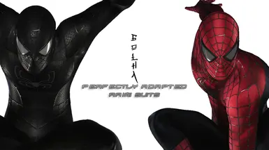
THE MOST VOTED ONES WILL BE ADDED TO THE MOD
now we need an better tasm1
https://www.nexusmods.com/marvelsspiderman2/mods/104
https://www.nexusmods.com/marvelsspiderman2/mods/90
Awesome work, thank you for this! I just noticed some weird hand shapes. Not sure if it's intended, but here’s a comparison with the vanilla hand shape.