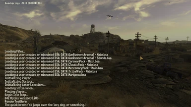
Great mod! just a minor question, I didn't install VUI+ but my pipboy and dialogs still appear to be vanillas' font , and Vanilla Fonts Revisited hasn't been overwrite. any idea what could be the cause?
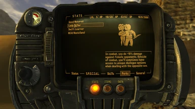
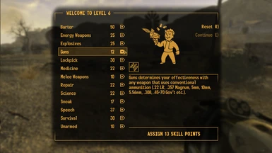
This is the best font remaster I've seen so kudos to you man, I just cant help but see that some font are thicker than in vanilla, especially in the body text (the level up menu skills, description and dialog) I've gone into a bit of a rabbit hole searching through font sites to see if there's a thinner variant online and cant for the life of me find it, I wonder if the developers used an older variant of the font but its weird man
I should be able to tweak the boldness without issue.I will look into it. You can expect me to upload an update sometime in late February or early March, unless I forget or something.
Hey ItsMeJesusHChrist, is there any chance you'd be interested in making a tutorial for doing something like this so we can apply our own custom fonts to VUI+? I really want to do this with the classic fonts (JH_Fallout, Fallouty, Gothic 821 Condensed) but I'm not very knowledgeable on how to resolve alignment issues. No pressure at all.
Any chances to add polish fonts? If you had a desire to do something about it here are the default Polish fonts: https://drive.google.com/file/d/1z2Mm5i0oP2VLLk_npV5kK2UOczOW3E2m/view?usp=sharing
How the hell'd we wind up like this? Why aren't we able To see the gifs that we missed And try to compare the frames Now the mod description is played out like this Just like a used toilet paper Let's rewrite the description to something that fits Instead of relying on mod guides
Nothing's wrong Just as long as you know that someday I will
Someday, somehow I'm gonna make the gif alright, but not right now I know you're wondering when (You're the only one who knows that)
this dude uses the flag of an Anglo-Saxon slave colony mistakenly called a state for his profile picture and you seriously don't understand the reason why he gives such fucked up answers
Ah, my dear sir, your remarks are as fervent as they are misguided. One cannot help but wonder if your intellectual faculties might be more suitably employed in the development of your "Sexy Farts More" mod. Surely such a distinguished achievement occupies the gaseous halls of your mind, bereft of the discernment necessary to recognize the profound irony and hypocrisy that so conspicuously envelops you.
Any chance you could maybe look into making the fonts less "bold"? My only real issue with this mod is how much thicker the fonts are compared to vanilla, otherwise it looks great.


117 comments
-
1
-
2
-
3
- ...
-
5
-
JumpIf you had a desire to do something about it here are the default Polish fonts:
https://drive.google.com/file/d/1z2Mm5i0oP2VLLk_npV5kK2UOczOW3E2m/view?usp=sharing
Why aren't we able
To see the gifs that we missed
And try to compare the frames
Now the mod description is played out like this
Just like a used toilet paper
Let's rewrite the description to something that fits
Instead of relying on mod guides
Nothing's wrong
Just as long as you know that someday I will
Someday, somehow
I'm gonna make the gif alright, but not right now
I know you're wondering when
(You're the only one who knows that)
Anyway, it's not a big deal, was just confused why the gif that the comments mentioned isn't there.
Any idea why?
Could be something over writing the font
-
1
-
2
-
3
- ...
-
5
-
Jump