NOTES I won't be messing with gameplay this time since all important stuff is on gamebryo side (or it is just winning over UE) and we already have 1000 more than necessary gamebryo/creation engine modders.
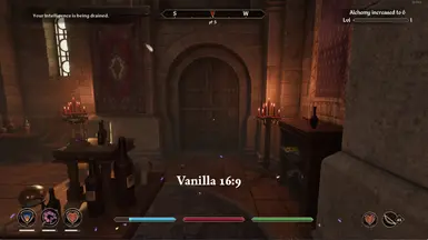
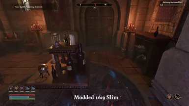
CHANGELOG 1.1 - very basic (and not tested fully) HUD rework: in addition to smaller compass, gauges organized in vertical stack and placed in a left bottom corner. Status icons made smaller and moved slightly higher, to free space for bars. Use on your own risk, probably a mess on UW (version for it later). 1.1.2 - added UW version. 1.2 - added 16:9 Slim version. all widgets (beside enemy gauge, unfortunately) scaled down and moved to screen edges. 1.2.2 - added fitting status bar for enemies for slim version (should be higher, but yet need to find name plate settings). 1.3 - fixed too small compass in Just Smaller Compass, from 60% to 86% with text size additionally compensated to almost vanilla size. working on other versions updated. 1.3.1 - updated compass (86% scale instead of 60%) in 16:9 Slim. And minor adjustments. Gauges direction wasn't changed. Will add similar Slim presets for 21:9 and 16:10 tomorrow. 1.3.3 - reuploaded smaller compass only and added experimental 70% opacity version. might come in handy for someone. 1.3.4 - fixed just smaller compass again and 16:9 Slim OLED (was missing slim compass). 1.4 - updated 16:9 default, 16:9 Slim and 16:9 OLED, they got damage indicator fixed and a few adjustments related to level gauge, compass and magicka/weapon icons. All feature smaller compass, its ~80% with text compensated to be vanilla - there shouldn't be any issues reading it. 1.4.4 - on request added 21:9 Slim OLED. 1.5 - added a lot of compass add-ons. you need to install them in addition to main Better HUD version of your choice, addon will win/compensate compass settings from Better HUD:
Immersive - no text, no hostile and POI markers, only cardinals,
No Text - default compass, but without text for POIs and distance,
Even smaller - 65% compass,
Even smaller OLED - 65% compass with 70% opacity,
Vanilla - 100% size vanilla compass for low vision people.
1.5.1 - added 65% scale compass with no text. 2.0 - only for 16:9 Slim:
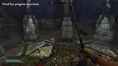
fixed bars progress directions (in a very hacky way, since materials runtime properties don't seem to be moddable). 3 new files added to the archive,
made breath bar slimmed,
made enemy name plate transparent, in a manner of Less Fugly Black Infoboxes,
status icons organized in a way that allow to show 5 of them instead of 3 in vanilla.
Other versions will get update once this one is properly tested. 2.0.1 - very minor fix to 16:9 and pushed all changes to 16:10 Slim. 2.0.2 - tweaks and fixes were pushed for all versions (16:9 default, 16:9 Slim, 16:9 Slim OLED, 21:9 Slim, 21:9 Slim OLED). 2.1 - WinterElfeas found a way to disable bars fadeout. Adding it as add-on in Optional Files. 2.2 - few tweaks to enemy name and bar (deployed to 16:9 Default only so far):
progress direction from left to right instead of symmetrical, in line with character bars.
NPC type name has no background now, text outlined instead.
both HP bar and text sit tighter now and closer to the compass.
SUGGESTIONS TIME IS OVER, DO NOT ASK FOR MORE VERSIONS, you had 3 days for that, there are enough versions now. Most issues were fixed, most requested AND doable things made it to the mod. I don't have time for your every whim, modding UI in Unreal Engine is extremely time-consuming and unfriendly matter. I will also block every person that is trying to demand smth in DM.
Concerning 32:9 - I'd made a version for it, but I release only tested mod and I won't be able to buy that screen for this sole mod's sake.
It’s clear you’ve put in a ton of time and effort to meet the requests of many and I just want you to know that we appreciate you! Thank you for making so many versions for us <3
Only thing that was difficult was the ~mods folder step, if you could add a small note to let the user know that this is not a folder that is there by default and they will need to create this to put the mod in, would help a lot of less experienced modders
You could do the same with mods you're interested in, but don't want to get yet due to the mod possibly bringing bugs or something. I have UORP tracked for now until modding for the game is "better".
Having the health, magicka, and stamina bars fade from right to left feels super clean and it made perfect sense with the new placement. However, I'm really not feeling the new change to the enemy health bar. Having it fade from right to left in the top center of the screen just doesn't feel right visually. IMO it looks so much better when it drained symmetrically from both sides. Would be awesome if you could add an optional file to bring the old symmetrical enemy bar behavior back. More options are always good, right? ;)
This is the biggest thing missing from the remake. I am so surprised nobody has brought the iconic enemy health bar back yet! It sucks having to view Oblivion from a Skyrim lense in the remake. I’d pay good money for a mod that brought the enemy health bar back..
That's not what I meant. All I asked for was for an optional file to revert the changes made with the enemy health bar in version 2.2. To make the "progress direction" symmetrical again, since it just flows, and looks, better that way when the health bar is in the middle of the screen. I don't want the original Oblivion enemy health bar back.
Sorry if I'm just blind, but is there no vanilla size version of the compass addon that disables the location text? I have an ultrawide 21:9 monitor so I prefer the larger compass, but I don't like the text.
Ahh, okay. Thanks for confirming. I've been using an older version of your mod and was planning to update, but it looks like you no longer support non-slim versions for 21:9. I had no way of knowing that you were offering version suggestions for three days (I don't go to every mod page every day to look at it unless I have an issue with that mod), so I unfortunately missed this. Not sure why anyone would want things even smaller on a monitor that large, but apparently they do lol.
Anyway, sorry for the rant (not directed at you, just unfortunate that you don't have the options I'm looking for). I'll probably just keep using the older version of your mod for now. Thanks!
For 2.2 16:9, what does the "progress direction" part mean? I compared screenshot 5 and 9 to try and figure it out, but I couldn't make out the change. Is it noticeable in those screenshots and I'm just blind to it?
vanilla NPC HP bar shrinks from both sides, aka symmetrical. not very informative, with half HP gone it still looks like almost full. also not in line with new character bars, which shrinks from the right to the left.
I assure you, I installed it right. You don’t have to be a rocket scientist, and I’ve been modding games longer than most people in this comment section have been alive, I’m starting to look like Uriel Spetim at this point. See some other comments where people had similar issues.
To elaborate, I completely remove old versions from my ~mods folder under paks before updating them, and I only used the one default size version. Other commenters said it may have been a weird conflict. I haven’t tried updating to newer versions since, as I am happy with the version I am using, so I can’t say if there is a conflict or if it has been resolved.
huge experience doesn't mean you can't make mistakes. you did one for sure, because the only reason why you have 2 bars of the same color is 000_BetterHUD_P files are not in the same folder with 000_GaugeWorkaround_P files.
The version I’m using now, which works for me, also has the same file types in the same folder the way it was with the version that didn’t work. Yeah, sure, mistakes happen, but I’m pretty sure I did this right. Unless I’m not understanding something, and you mean that the GuageWorkaround files SHOULDN’T be in the folder with the BetterHud files.
Either way, it’s fine. You’ve made a great mod, and the version I’m using now works fine for me.


558 comments
-
1
-
2
-
3
- ...
-
34
-
JumpI won't be messing with gameplay this time since all important stuff is on gamebryo side (or it is just winning over UE) and we already have 1000 more than necessary gamebryo/creation engine modders.
CHANGELOG
1.1 - very basic (and not tested fully) HUD rework: in addition to smaller compass, gauges organized in vertical stack and placed in a left bottom corner. Status icons made smaller and moved slightly higher, to free space for bars. Use on your own risk, probably a mess on UW (version for it later).
1.1.2 - added UW version.
1.2 - added 16:9 Slim version. all widgets (beside enemy gauge, unfortunately) scaled down and moved to screen edges.
1.2.2 - added fitting status bar for enemies for slim version (should be higher, but yet need to find name plate settings).
1.3 - fixed too small compass in Just Smaller Compass, from 60% to 86% with text size additionally compensated to almost vanilla size. working on other versions updated.
1.3.1 - updated compass (86% scale instead of 60%) in 16:9 Slim. And minor adjustments. Gauges direction wasn't changed. Will add similar Slim presets for 21:9 and 16:10 tomorrow.
1.3.3 - reuploaded smaller compass only and added experimental 70% opacity version. might come in handy for someone.
1.3.4 - fixed just smaller compass again and 16:9 Slim OLED (was missing slim compass).
1.4 - updated 16:9 default, 16:9 Slim and 16:9 OLED, they got damage indicator fixed and a few adjustments related to level gauge, compass and magicka/weapon icons. All feature smaller compass, its ~80% with text compensated to be vanilla - there shouldn't be any issues reading it.
1.4.4 - on request added 21:9 Slim OLED.
1.5 - added a lot of compass add-ons. you need to install them in addition to main Better HUD version of your choice, addon will win/compensate compass settings from Better HUD:
- Immersive - no text, no hostile and POI markers, only cardinals,
- No Text - default compass, but without text for POIs and distance,
- Even smaller - 65% compass,
- Even smaller OLED - 65% compass with 70% opacity,
- Vanilla - 100% size vanilla compass for low vision people.
1.5.1 - added 65% scale compass with no text.2.0 - only for 16:9 Slim:
- fixed bars progress directions (in a very hacky way, since materials runtime properties don't seem to be moddable). 3 new files added to the archive,
- made breath bar slimmed,
- made enemy name plate transparent, in a manner of Less Fugly Black Infoboxes,
- status icons organized in a way that allow to show 5 of them instead of 3 in vanilla.
Other versions will get update once this one is properly tested.2.0.1 - very minor fix to 16:9 and pushed all changes to 16:10 Slim.
2.0.2 - tweaks and fixes were pushed for all versions (16:9 default, 16:9 Slim, 16:9 Slim OLED, 21:9 Slim, 21:9 Slim OLED).
2.1 - WinterElfeas found a way to disable bars fadeout. Adding it as add-on in Optional Files.
2.2 - few tweaks to enemy name and bar (deployed to 16:9 Default only so far):
Concerning 32:9 - I'd made a version for it, but I release only tested mod and I won't be able to buy that screen for this sole mod's sake.
Only thing that was difficult was the ~mods folder step, if you could add a small note to let the user know that this is not a folder that is there by default and they will need to create this to put the mod in, would help a lot of less experienced modders
Anyway, sorry for the rant (not directed at you, just unfortunate that you don't have the options I'm looking for). I'll probably just keep using the older version of your mod for now. Thanks!
To elaborate, I completely remove old versions from my ~mods folder under paks before updating them, and I only used the one default size version. Other commenters said it may have been a weird conflict. I haven’t tried updating to newer versions since, as I am happy with the version I am using, so I can’t say if there is a conflict or if it has been resolved.
The version I’m using now, which works for me, also has the same file types in the same folder the way it was with the version that didn’t work. Yeah, sure, mistakes happen, but I’m pretty sure I did this right. Unless I’m not understanding something, and you mean that the GuageWorkaround files SHOULDN’T be in the folder with the BetterHud files.
Either way, it’s fine. You’ve made a great mod, and the version I’m using now works fine for me.
-
1
-
2
-
3
- ...
-
34
-
Jump