please make a version where all bars are on the left side stacked neatly on top of each other (with a slimmer look perhaps) or at least make the comapss a bit slimmer? this is perfect otherwise
I really love this mod! Unfortunately the transparent effects on the spell and weapon icons cause some of them to be a bit ugly and unreadable (especially in the menus), as well as the enchantment charge "clock" being visible behind the icon which looks a little unfinished (because it was never meant to be seen)
The original design has them on a darker brown background making them much more readable and eliminating the issues with enchantment effects being visible behind the icon.
Is it possible to have this fixed or a separate version of the mod uploaded without the transparencies changed? I prefer the full opacity health bar as well, though that's just a preference, not a functionality issue. Matching the compass feels unnecessary and only causes clarity issues.
(reposted this to the Bugs page with photo examples)
I noticed my mana bar won’t disappear unless I have full mana, is it possible to fix this? Without the mod it will vanish unless in combat or actively casting
Mana bar might be stuck visible if it's currently damaged or being drained (for example, vampirism will damage your stats and make them constantly visible despite them never actually visibly draining)
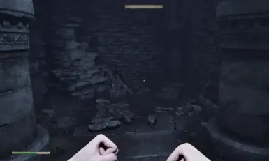
since you removed those ugly black boxes, could you also remove item outlines, those which appear when you look on item to take it, they look especially annoyning with reshades, also you forgot to remove black boxes on map tab
I used this in conjunction with the "Better HUD" mod by Caites to move the three bars to the bottom-left of the screen like in the provided screenshot, but I noticed the way the three bars deplete was made for the centered vanilla Remastered UI. Fatigue looked fine depleting from the right side of the bar, but Magika depletes from the left and Health depletes from both sides. Uninstalling this for now until an alternative file is provided for the bottom-left alignment, but it otherwise looks great when used by itself.
Edit: It looks like Better HUD has the same issue on its own, so it's not actually this mod's fault (which by default keeps the bars still centered as in vanilla).
I'm noticing that, when using this mod, the markers that represent enemies on my compass have a vertical line to the left of the icon that flashes in and out as the marker moves across my compass. Is this a fixable issue, something on my end, or is it more a side-effect of switching to a compass with a colored background as opposed to black? If so for the last one, is it possible anything can be done about it?
Love it, thank you for making this, you absolute Legend <3
Only wish it also removed the button prompt, the (A) / (X) / [E] that shows up. (Very much not needed IMO.) But you removed that terrible black box that would show up around the name of whatever you were looking at, so I just want to give you a hug <3


45 comments
The original design has them on a darker brown background making them much more readable and eliminating the issues with enchantment effects being visible behind the icon.
Is it possible to have this fixed or a separate version of the mod uploaded without the transparencies changed? I prefer the full opacity health bar as well, though that's just a preference, not a functionality issue. Matching the compass feels unnecessary and only causes clarity issues.
(reposted this to the Bugs page with photo examples)
Edit: It looks like Better HUD has the same issue on its own, so it's not actually this mod's fault (which by default keeps the bars still centered as in vanilla).
EDIT: he released a fix
Only wish it also removed the button prompt, the (A) / (X) / [E] that shows up. (Very much not needed IMO.)
But you removed that terrible black box that would show up around the name of whatever you were looking at, so I just want to give you a hug <3