NOTES I know its not optimal - completely getting rid of background an adding outlines for text would be better. But its way more complicated since background color is used for context (like stealing), text colors too, there are icons and UE tools ain't friendly for such tasks. I'm not even sure its possible without full UE project (which we don't have).
But its better than nothing.
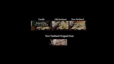
CHANGELOG 1.1 - main version updated for better compatibility (was conflicting with No Vignettes) and added 80% scale version with same 70% transparency of background. 1.1.1 - makes empty plate more readable.
1.2 - added experimental version with text outlining. Its better option for naked text readability, but it doesn't cover icons for item stats and numbers for them. if someone feels enthusiastic enough to rework those few icons in atlas to make them filled with main color and outlined with black, that would make things almost ideal.
1.3 - added version without E prompt.
1.3.1 - few tweaks to outlined version (added outline for stats text, changed main text font - its original can't be properly outlined, increased icons size) and added outlined version without prompt on request. icons still not clearly visible on very well-lit objects.
1.4 - final form pretty much. Main version is outlined one now, versions with transparent background are in Optional Files now. Icons got outlined too.
1.4.1 - added outlined version with original font. It still have outlining issues, but I tried to pick decimal font size minimizing issues to 'e' letters.
1.4.2 - added outlined version with vanilla font and prompt. since vanilla font can't be properly outlined, there will be visible issues with some letters. you asked for it.
I was hoping this mod meant the infobox that appears when browsing your inventory, since it's buggy and shows less information than in the original game. The old one used to show more effects, weapon charges, alchemy tool effectiveness, and what soul was contained in each soul gem.
And that is a quality of life I miss, and now most of it has been delegated to the more info tab, which feels like a functional downgrade.
Having to press H then C and sometimes first F is the single most annoying thing about the game, especially because some items have extra info and some not, forcing you to press both buttons again if one of those items is in between the two you are checking.
Okay, it removes the "E to take" prompt... I think. Sorry I am new here to all of this. First i did manual modding, now I am trying to set up vortex so that the mods update themselves. Just a little difficult parsing through all of this, thanks btw. you have got some of the best mods.
Is there a way to switch the LT RT & LB RB on controllers so the are reversed only in the menus for the tabs? It feels awkward that the triggers switch the bottom tabs and the bumpers switch the top tabs in the menus. Im just wondering I understand if it can not be done or you don't have the time. I endorse this mod thanks for your work.
would it be possible to remove the condition thingy? I find it beyond pointless that it takes up screenspace for no reason if most items you find on the ground are 100% condition anyways...
I started getting an issue where the info appears regardless of range. I can look at an object 100ft away and it will bring up the text (I am using the Outlined No Prompt version), but I cant interact with it until I am in normal range. I am not actually positive if it is this mod that is causing it (it worked normally for a few days before this started happening), but I have not installed any other mods that change the infobox/text. Has anyone else had this issue? does anyone know what is causing it? Update: Tried uninstalling the mod and the issue persists, so Im assuming its a different mod causing it. If anyone has any idea please let me know! BTW Im glad its not this mod cuz I like it a lot. The no prompt no infobox looks great and very immersive. Thanks! Update2: Im an idiot. thats just a vanilla feature of having a telekinesis spell equipped (or a custom spell with telekinesis as an effect for the spell absorption exploit, not that i would ever do something like that...)
I have a request please. Is there any chance you could look into also doing the same for dialogue screens?. I hate the black box name of the npc i am talking to as well as that line along the bottom and the unmissable horrid skip button. The skip should be something very discreet and maybe off to the right. That long line also is so not needed. and your invisible black box style for the name in dialogue would be really nice. this way when i go from regular exploring screen to the dialogue transition it all is nice with no black boxes. :)
Nice Mod :D Adding this for people like me, searching the comments for clues for different languages, I can confirm, this Mod works like a charm even with the german version (deutsch), without anything popping up with wrong names
Can you make a version that removes ALL those ugly box? I mean the subtitle box when you hear ppl talk near you and the loot box on the top left also. Thank you :)
if that would be simple, it would be done long ago. removing it completely as a texture will make text unreadable on well-lit background. editing it in a proper way in assets not always possible due to how game made a mix of old and new assets, for those widgets even vanilla settings paked lead to crashes.
As lasagnaforone pointed out its a matter of look with framegen but its not a huge problem. At least the loot infobox is not in the middle of the screen but the dialogue one may make me turn off subtitle soon tho.
Anyways ty for all your mods Caites and your hard work is well appreciated.


176 comments
-
1
-
2
-
3
- ...
-
9
-
JumpI know its not optimal - completely getting rid of background an adding outlines for text would be better. But its way more complicated since background color is used for context (like stealing), text colors too, there are icons and UE tools ain't friendly for such tasks. I'm not even sure its possible without full UE project (which we don't have).
But its better than nothing.
CHANGELOG
1.1 - main version updated for better compatibility (was conflicting with No Vignettes) and added 80% scale version with same 70% transparency of background.
1.1.1 - makes empty plate more readable.
1.2 - added experimental version with text outlining. Its better option for naked text readability, but it doesn't cover icons for item stats and numbers for them. if someone feels enthusiastic enough to rework those few icons in atlas to make them filled with main color and outlined with black, that would make things almost ideal.
1.3 - added version without E prompt.
1.3.1 - few tweaks to outlined version (added outline for stats text, changed main text font - its original can't be properly outlined, increased icons size) and added outlined version without prompt on request. icons still not clearly visible on very well-lit objects.
1.4 - final form pretty much. Main version is outlined one now, versions with transparent background are in Optional Files now. Icons got outlined too.
1.4.1 - added outlined version with original font. It still have outlining issues, but I tried to pick decimal font size minimizing issues to 'e' letters.
1.4.2 - added outlined version with vanilla font and prompt. since vanilla font can't be properly outlined, there will be visible issues with some letters. you asked for it.
The old one used to show more effects, weapon charges, alchemy tool effectiveness, and what soul was contained in each soul gem.
And that is a quality of life I miss, and now most of it has been delegated to the more info tab, which feels like a functional downgrade.
Having to press H then C and sometimes first F is the single most annoying thing about the game, especially because some items have extra info and some not, forcing you to press both buttons again if one of those items is in between the two you are checking.
Really hoping someone will make a mod for this!
triggers switch the bottom tabs and the bumpers switch the top tabs in
the menus. Im just wondering I understand if it can not be done or you
don't have the time.
I endorse this mod thanks for your work.
Дякую вам!
I started getting an issue where the info appears regardless of range. I can look at an object 100ft away and it will bring up the text (I am using the Outlined No Prompt version), but I cant interact with it until I am in normal range. I am not actually positive if it is this mod that is causing it (it worked normally for a few days before this started happening), but I have not installed any other mods that change the infobox/text. Has anyone else had this issue? does anyone know what is causing it?Update: Tried uninstalling the mod and the issue persists, so Im assuming its a different mod causing it. If anyone has any idea please let me know!
BTW Im glad its not this mod cuz I like it a lot. The no prompt no infobox looks great and very immersive. Thanks!
Update2: Im an idiot. thats just a vanilla feature of having a telekinesis spell equipped (or a custom spell with telekinesis as an effect for the spell absorption exploit, not that i would ever do something like that...)
Is there any chance you could look into also doing the same for dialogue screens?. I hate the black box name of the npc i am talking to as well as that line along the bottom and the unmissable horrid skip button. The skip should be something very discreet and maybe off to the right. That long line also is so not needed. and your invisible black box style for the name in dialogue would be really nice. this way when i go from regular exploring screen to the dialogue transition it all is nice with no black boxes. :)
https://www.nexusmods.com/oblivionremastered/mods/2529?tab=description
Adding this for people like me, searching the comments for clues for different languages, I can confirm, this Mod works like a charm even with the german version (deutsch), without anything popping up with wrong names
Can you make a version that removes ALL those ugly box? I mean the subtitle box when you hear ppl talk near you and the loot box on the top left also. Thank you :)
Anyways ty for all your mods Caites and your hard work is well appreciated.
-
1
-
2
-
3
- ...
-
9
-
Jump