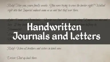
This looks great, but would it be possible to get a bolder version of this? The typeface is a bit spindly and can be a bit hard to read when you have aggressive astigmatism like I do.
This is awesome. But I played original Oblivion. I'm getting old. Any chance you have a slightly heavier font weight typeface for an optional version? I like that the new font is so easy to read, but agree it is ugly as sin. There must be a better compromise for those of us who guess on the second half of the eye exam.


23 comments
A version with Hesperides would be awesome!
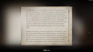
Some letters the body text will be in normal font, but the persons signed name at the end will be in Bilbo.
The chosen font "Bilbo" is also a little hard to read, but that's just personal taste. Overall the mod works great!
Thank you.